Designing and marketing the Billabong Pro Tahara 2013 in Japan
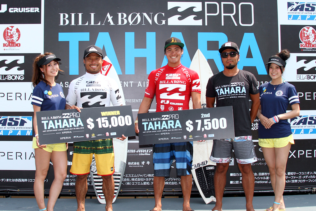
Turning back the clock to 2013, to an important event in my career: the annual Billabong Pro Tahara, held at Tahara in Japan’s Aichi Prefecture. For four days, this was the largest surfing event in Japan, drawing top surfers from across the globe, all competing for a prize pool of USD $95,000.
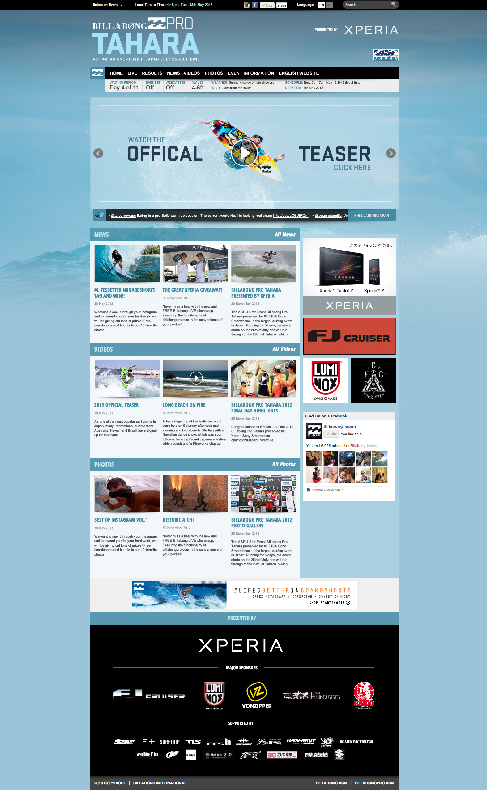
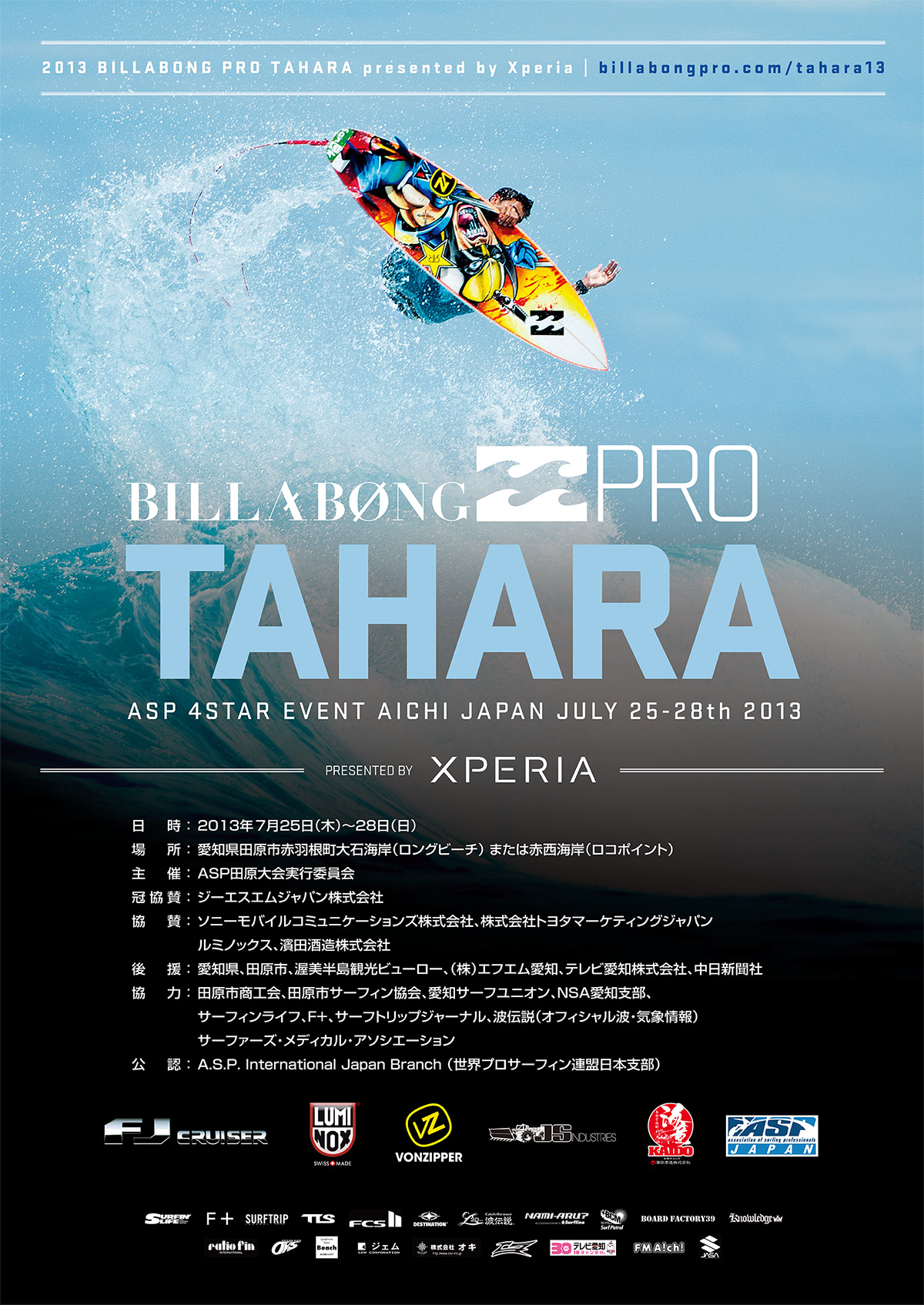
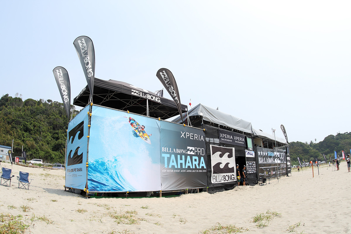
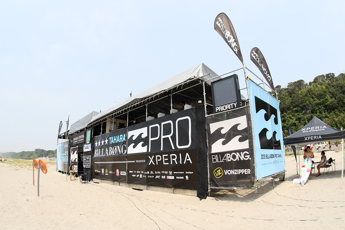
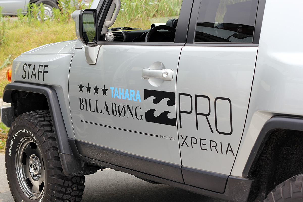
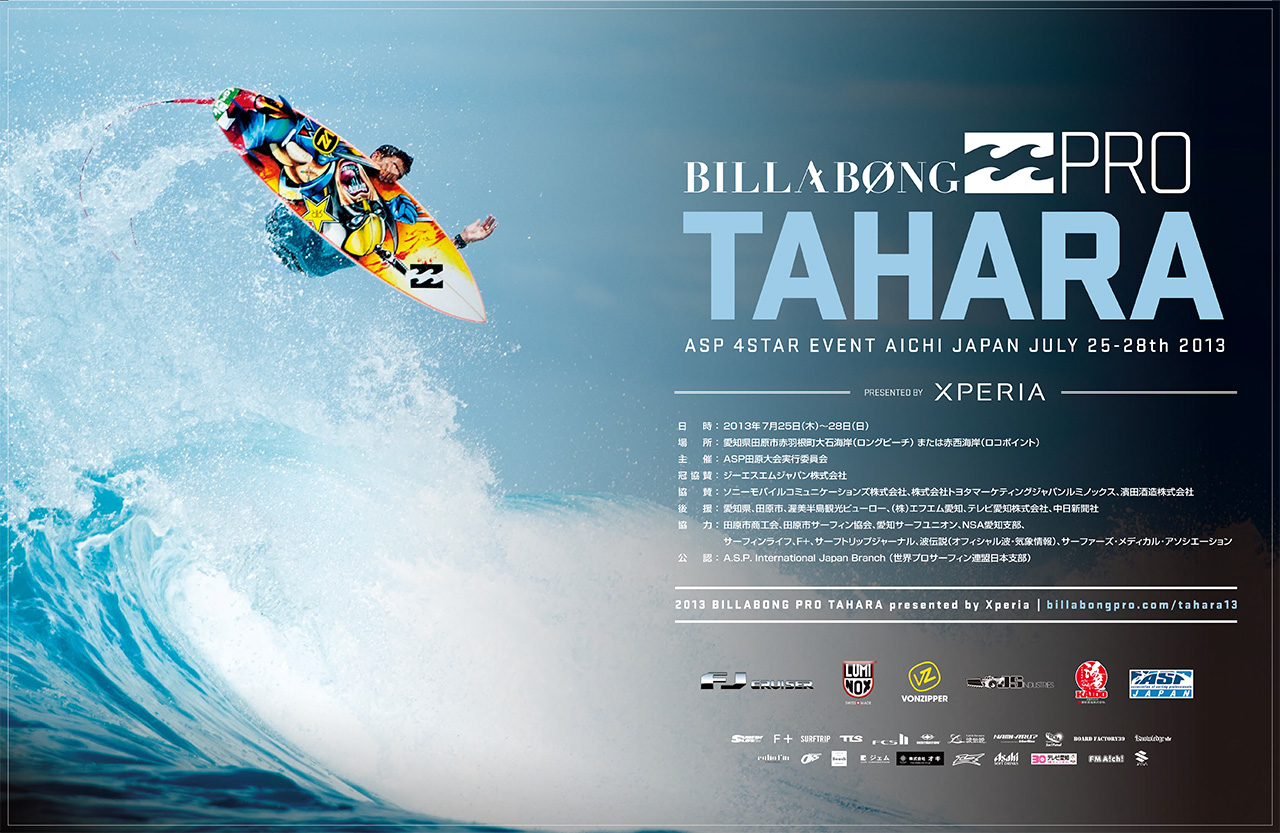
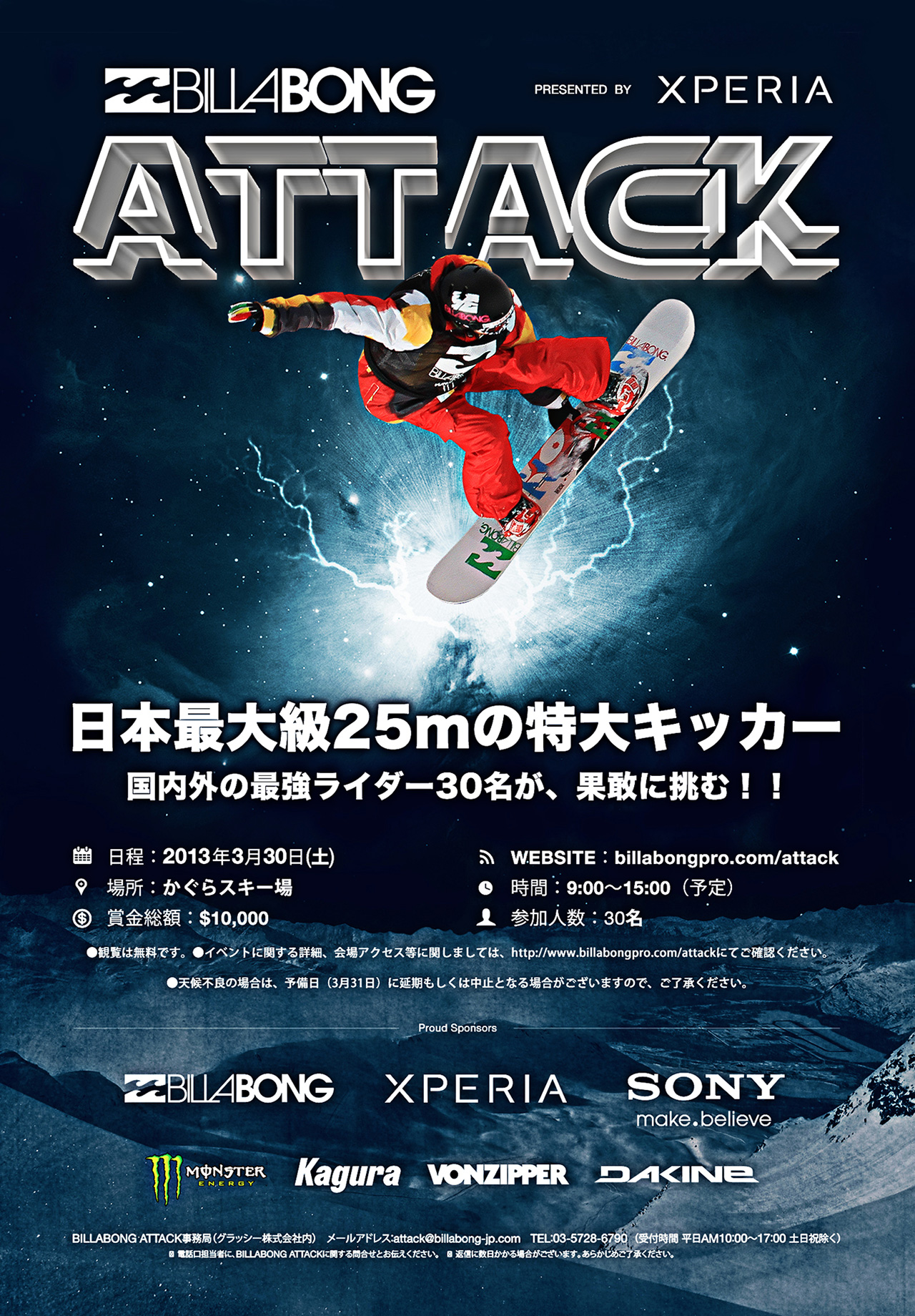
Each year, I had the privilege and the significant task of designing the event’s complete branding. This wasn’t just about a logo; it involved rolling out a cohesive visual identity across all event signage, the website design, and a wide range of video content. It was a comprehensive undertaking that needed to capture the spirit of both Billabong and the competition itself.
To say these events were demanding would be an understatement They were genuinely some of the hardest, most intense days I’ve ever experienced. Days would typically kick off around 5 am and often stretch through to midnight, sometimes later, leaving only a few hours for sleep before it all started again. The pace was hectic, but also really rewarding.
My role on the ground often extended well beyond the core branding work. I found myself involved in the production of the live webcast, production and direction for video content, keeping social media channels updated, and, when a spare moment appeared, grabbing my camera for photography content. This photography work often tied in with looking after our event sponsors, managing their presence and ensuring good communication and PR with their teams on site. It was a multifaceted role that required adaptability and a lot of energy.
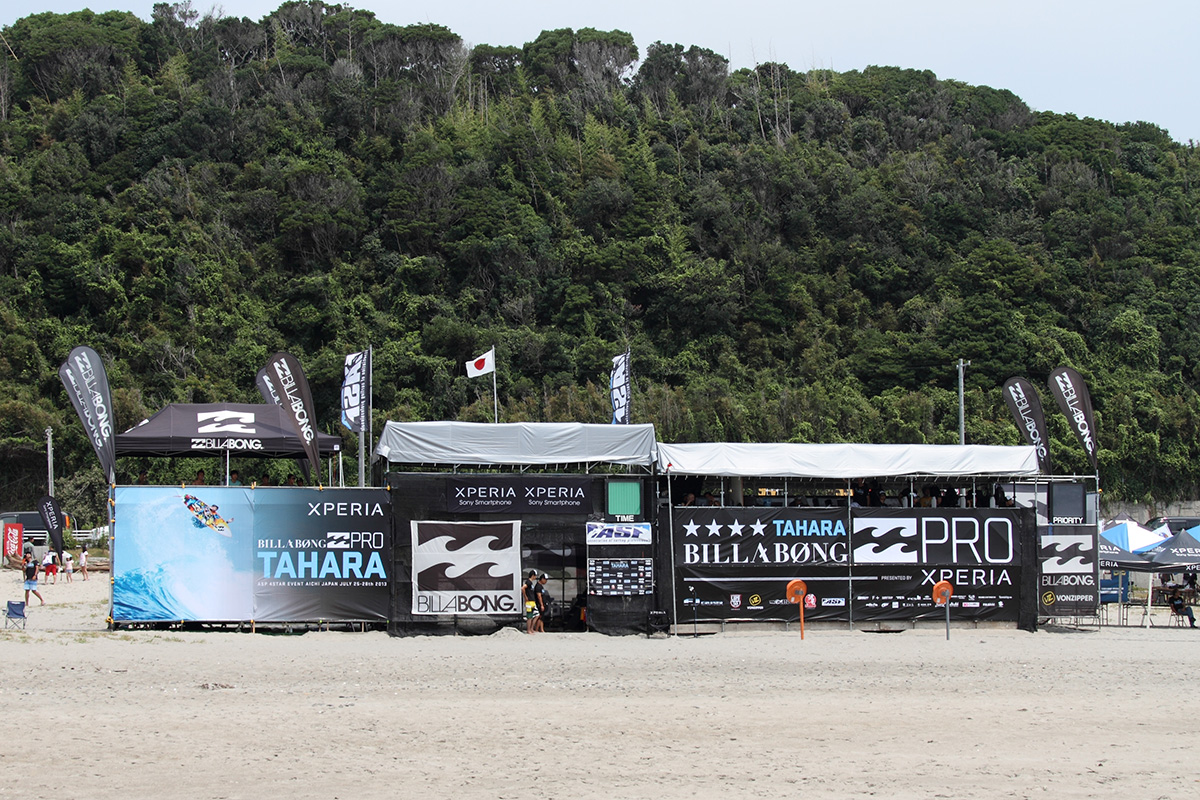
Despite the intensity, my favourite part, without a doubt, was always the initial design and branding phase. Being able to envision how a cohesive brand identity would unfold across every single marketing touchpoint, that was the kind of challenge I truly enjoyed. Seeing the designs come to life, from the large-scale banners that covered the event tents and stages, visible from afar, to the online branding across websites, social media, and external media outlets, was really satisfying. The branding had the potential to reach hundreds of thousands of people, so making it memorable and engaging was always my key goal.
The 2013 event featured a distinctive black and blue colour story, a strategic choice that aligned with some of Billabong’s key product lines for that year, ensuring brand synergy.
Looking back, I have such great memories of the Billabong Pro Tahara events. The pressure was immense, the hours were long, but the sense of accomplishment and the opportunity to be part of such a major international event makes me feel incredibly grateful.
Below, you’ll find some more images and videos showcasing the event and the branding we created.