The journey of refreshing a paint brand, from a strategic colour story on packaging to an ambitious pivot in web development.
Client: Baxta Industries
Industry: Commercial Painting
Project: Branding, Graphic Design, Shopify Development & WordPress Development
Baxta Brand Refresh & Website Journey
This case study takes a look back at a comprehensive brand refresh I undertook for Baxta, a paint and rendering products brand under the Usher Group umbrella. The project was kicked off following the appointment of new management and the introduction of a new range of paint products. The time was right for a complete brand overhaul – a new logo, font story, and colour story to give Baxta a fresh, modern identity.
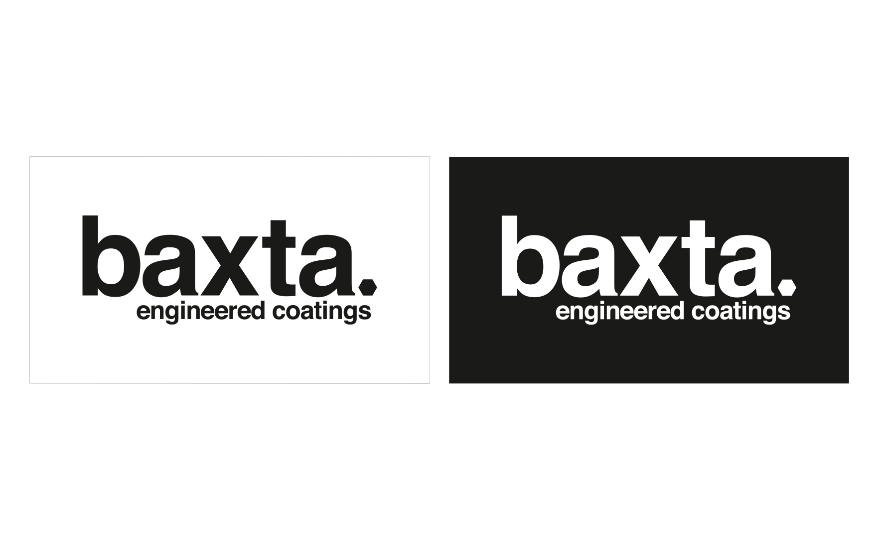
Logo Lockups
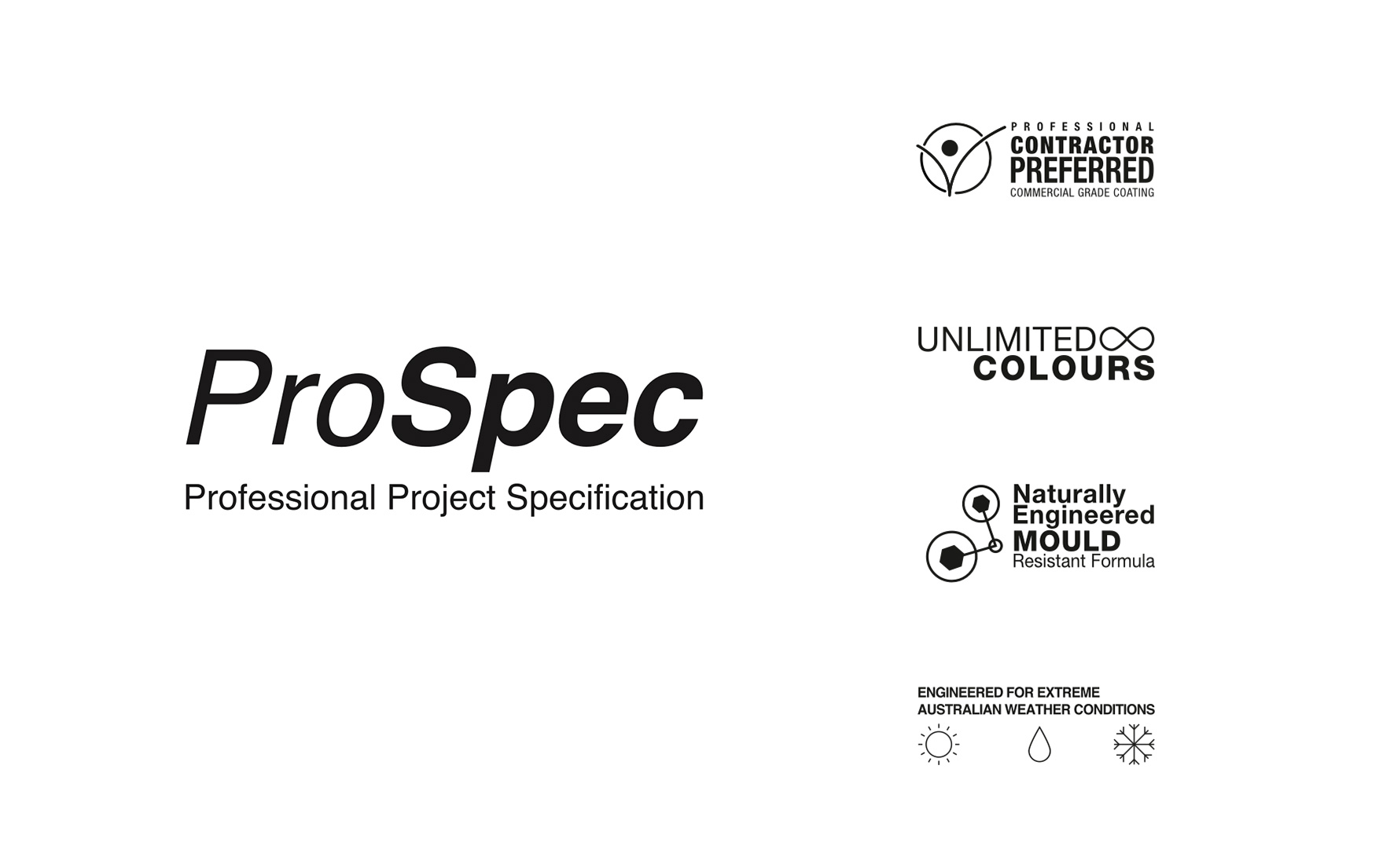
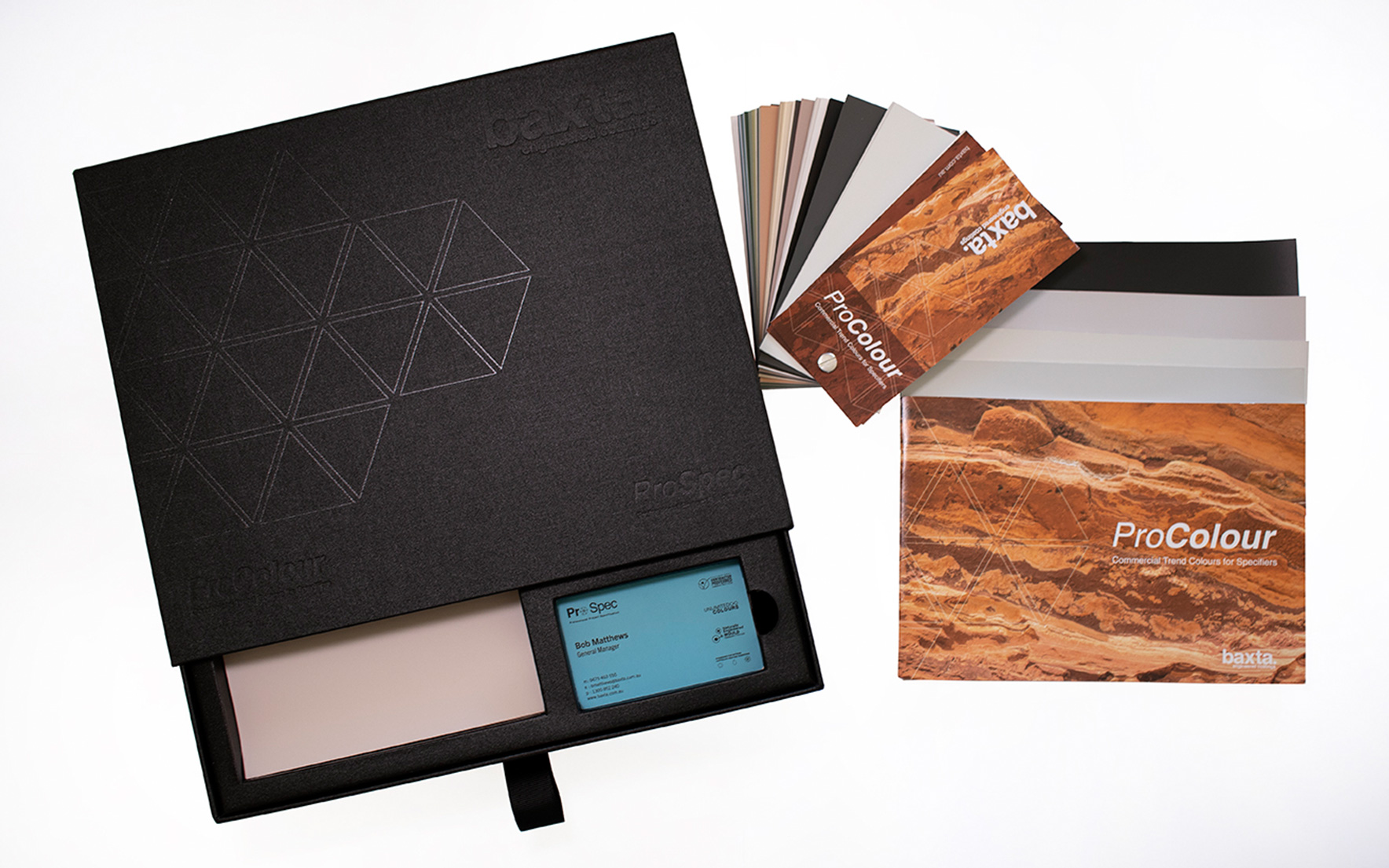
ProSpec Branding
The Creative Brief: Cohesion and Clarity
The primary goal was to modernise Baxta’s look and build a new, cohesive visual system across its entire product line. A key part of the brief was to create a brand that was completely distinct from its parent company, Usher Group.
Functionality was also crucial. We needed a system that offered easy visual identification for workers on busy job sites. The strategy was to use a strong colour story to segment the different product types, making it simple for tradespeople to grab the right pail or sack at a glance. The overall vibe we aimed for was clean, modern, and, most importantly, trustworthy.
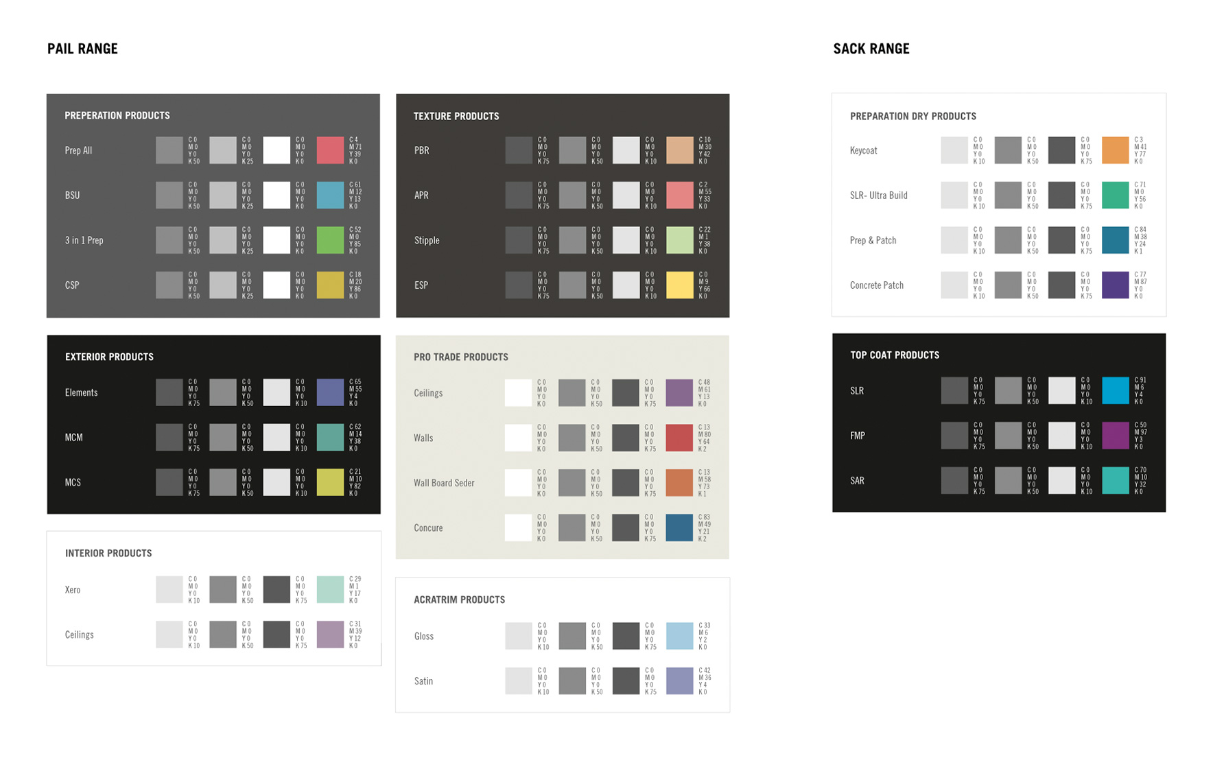
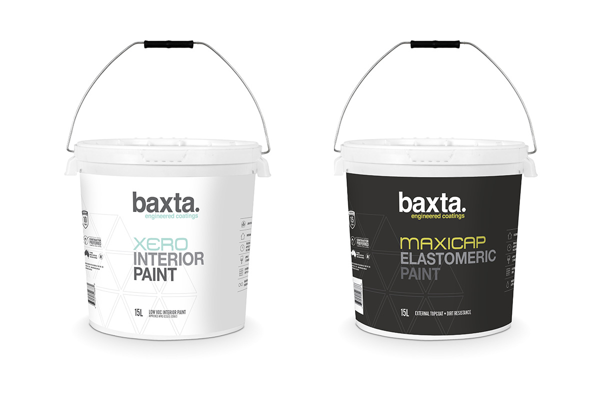
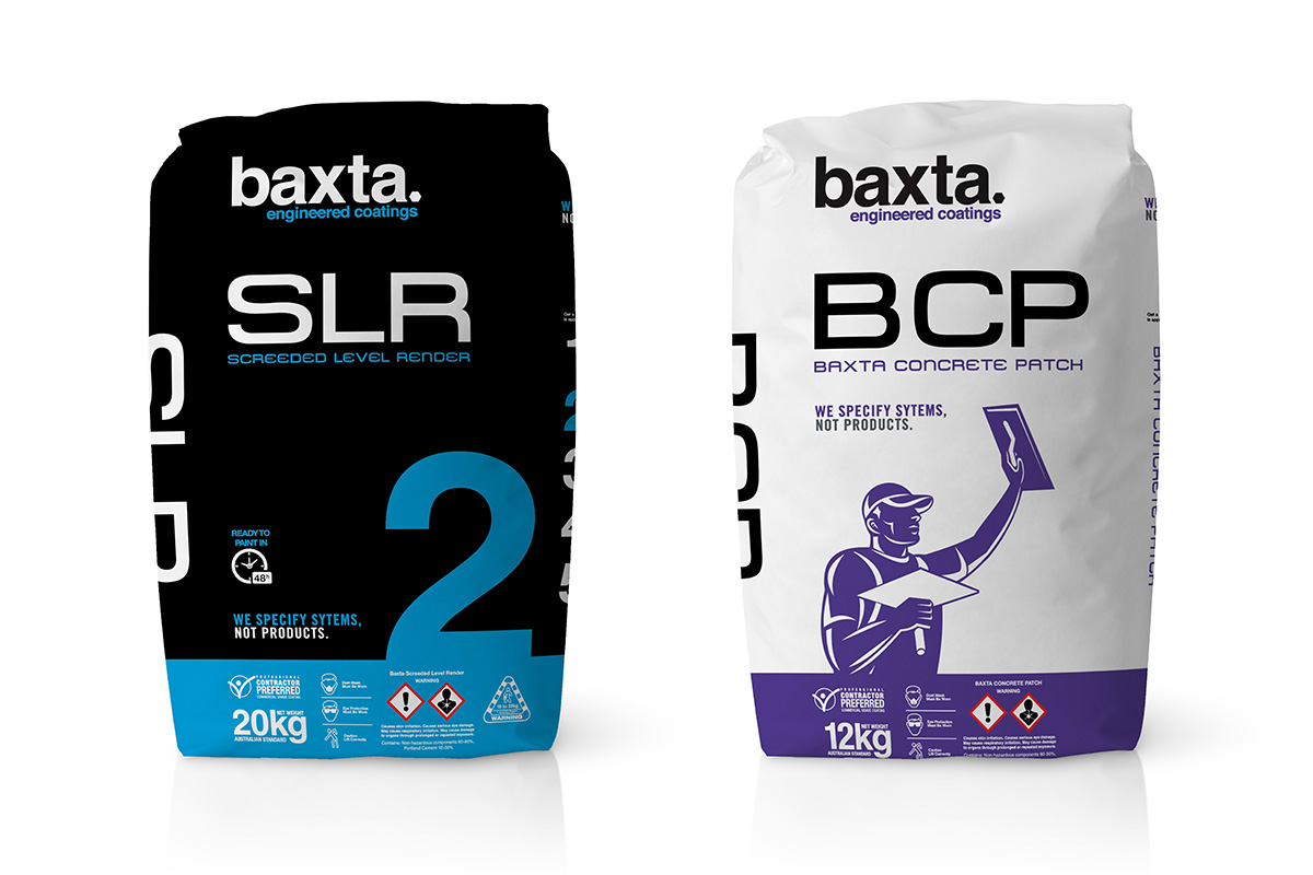
Product Colour Story
The Design Process: Minimalism and 3D Modelling
My approach to the branding was clean and minimal. The previous branding had some clutter, so I stripped back unnecessary graphics to place the focus squarely on the product itself.
The most challenging part of the branding process was perfecting the colour story for the packaging. It took a fair bit of playing around to get it right. A colour might look good on screen, but it wasn’t until the label was designed, applied to a 3D model of a paint pail, and then placed side-by-side with the other products that we could see how the system truly worked together. This required some careful back-and-forth work to ensure the colours were both distinct and harmonious.
Paint Products
Render Products
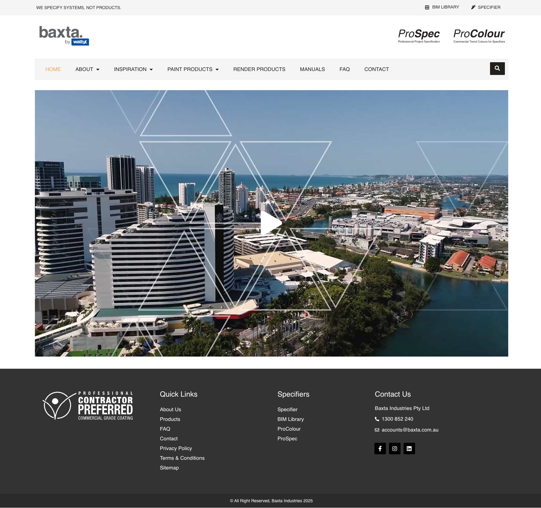
The Website Journey: An Ambitious Pivot
The web design component of this project was a journey in itself. The initial idea was brilliant: build a Shopify store to allow on-site project managers and foremen to order new paint directly, streamlining a process that had always been done over the phone. The build was one of the most challenging I’d undertaken with Shopify; we really pushed the platform to its limits, and with a lot of creativity, I achieved the functional goals.
However, in the end, the system wasn’t being used by the workers. It was a bit too advanced, and the long-standing habit of calling in orders was hard to break.
Recognising this, we made the strategic decision to pivot. We moved away from the costly Shopify store to a more flexible WordPress and WooCommerce setup. This still allowed us to showcase the full product range using categories, but instead of direct purchasing, we integrated enquiry forms. This transformed the site from a struggling e-commerce platform into a powerful digital catalogue and lead generation hub, with the freedom to add custom pages for case studies, FAQs, and inspiration.
WordPress Website
A Comprehensive Rollout
Beyond the packaging and the two websites, the new branding was rolled out across a full suite of materials to ensure a consistent presence, including business cards, brochures, technical data sheets, and vehicle wraps.
Reflection: A Truly Rewarding Experience
What was most rewarding about this project was being so deeply involved across so many touchpoints for the brand – from the initial branding concept through to the physical product packaging, the marketing collateral, and the final functioning website. Seeing it all come together cohesively is a truly enjoyable experience.
On top of that, the project received great feedback not only from the client but, most importantly, from their customers as well, confirming that the new ‘clean, modern, and trustworthy’ brand identity had hit its mark.