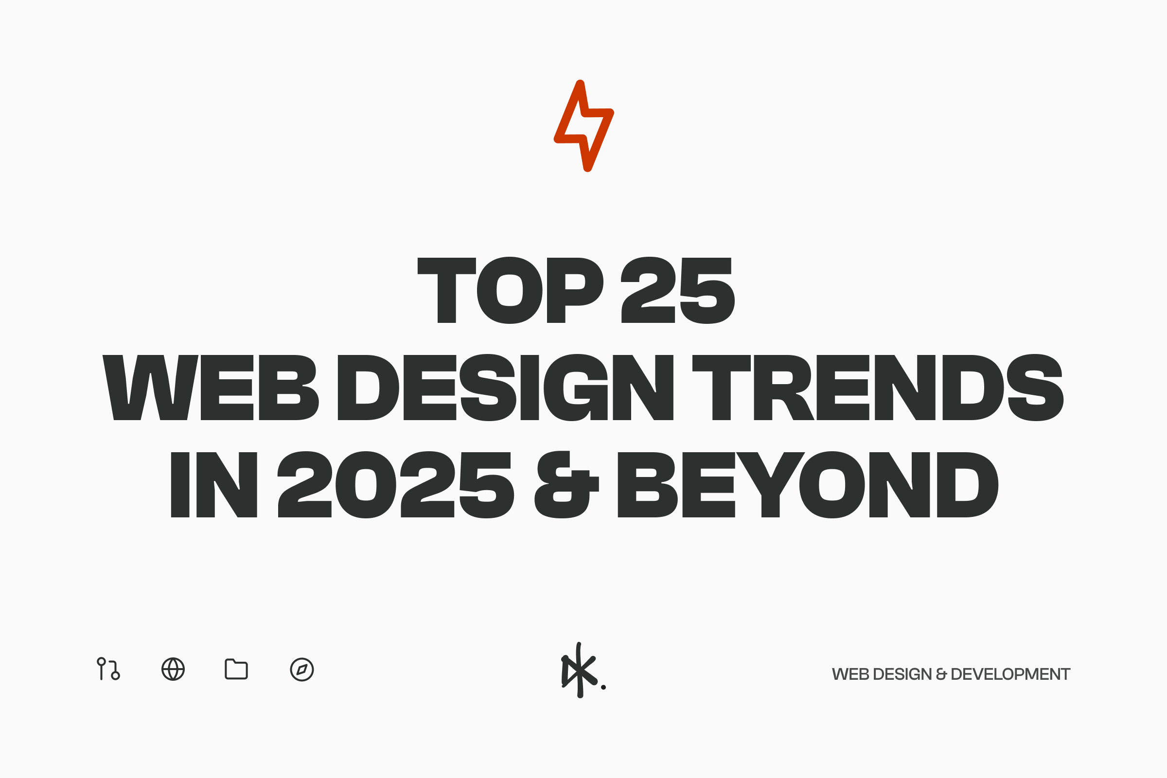
The Ever-Evolving Canvas of the Web – Current Trends of 2025
Alright, let’s talk about the digital realm… it’s forever changing, right? And web design? In my opinion, that’s the beating heart of it all. As we look into and beyond 2025, the trends popping up aren’t just pretty; they’re serious reflections of tech breakthroughs happening at the moment, and what you (the user!) actually want, and a big push for online interactions that genuinely mean something. If you’re looking to build a website that’s not just ‘now’ but truly clicks with people and gets results, you need to be on top of these paradigm shifts.
*Disclosure: I only recommend products I would use myself and all opinions expressed here are our own. This post may contain affiliate links that at no additional cost to you, I may earn a small commission. Learn more
Table of Contents
A. The Genesis of Trends: Where Do They Come From?
So, where do these web design trends actually come from? It’s a mix of lots of cool stuff. Think new tech like Artificial Intelligence (AI) getting smarter by the minute, WebXR (that’s Extended Reality – think VR and AR on the web) really coming into its own, and browsers that can do more than ever before. This all gives designers and developers a bigger, better box of tools (and toys!) to play with. At the same time, your expectations as a user are always changing. You’ve seen what slick mobile apps and immersive games can do, and now you want that same rich, easy-to-use vibe from websites as well.
Big changes in society also throw their weight around as well. We’re all more clued into sustainability, why making things inclusive and accessible for everyone is a must-do, and a general hunger for more real, authentic connections online. This pushes designers to think way beyond just making things look cool or work okay. And, of course, the design community itself is always experimenting, pushing the boundaries, and brewing up fresh ideas.
The trends we’re seeing line up for 2025? They’re all pointing towards making websites “more human, dynamic, and impactful”. This isn’t just about a new coat of paint; it’s web design growing up. We’re moving from just focusing on looks or tech wizardry to a more rounded approach that’s all about crafting awesome user experiences. It’s this blend: you wanting richer, smoother online journeys and the tech finally being able to deliver it – that’s really driving the web design trends for 2025. It’s not just about looking modern; it’s about truly connecting with users and making your digital presence count.
B. The Trajectory: Where Are Web Design Trends Heading?
So, what’s the big picture for web design? We’re definitely heading towards online experiences that are smarter, more immersive, super personalised, and built with a conscience. Artificial Intelligence is quickly shifting from a ‘nice-to-have’ tool to a ‘must-have’ foundation, shaking up everything about how we build and use websites. We’re talking AI streamlining how sites get made and powering cool user-facing stuff like hyper-personalisation and even generating content automatically. The fact that AI use is set to grow by a massive 25.2% each year until 2030 just shows you how much of a game-changer it is for the long haul.
There’s a real push to create web experiences that “resonate and inspire action”. This means going beyond just throwing information at people. It’s about crafting memorable, interactive journeys that really grab users and pull them in. The future isn’t about a random collection of trends; it’s about how they all work together to create smart, cohesive digital worlds. For example, AI-driven personalisation will likely team up with cool 3D elements and dynamic typography to build unique and captivating pathways for every user. This signals a move towards websites that don’t just react to you but actually anticipate what you need and offer a real experience.
C. A Note on Ranking
Alright, let’s get to the good stuff. The following 25 trends are laid out in a countdown. How did I rank them? It’s a mix, really: looking at how much they’ll likely shake up the user experience, their potential to make a real business difference, how ready the tech is right now, how widely they can be used, and how long they’re predicted to stick around, based on what the research is saying. Big foundational shifts, like AI becoming part of everything, and trends that can be used in lots of different ways and are in high demand from users? Those are generally going to be higher up the list.
Top 25 Web Design Trends in 2025
25. Gothic Badges and Crests
- What It Is: Picture this: modern gothic fonts teaming up with visuals that look like old-school badges or crests. You’ve seen it in branding and logos, but now these designs are making their way onto websites too.
- How It’s Being Used: Brands use these to give off a vibe of being reliable, experienced, trustworthy, and having a bit of that old-world class and sophistication. On a website, you might see them in the main intro section, down in the footer, or as cool little icons that reinforce who the brand is.
- Why It’s Important: In a digital world that’s always changing and full of fleeting content, these gothic badges and crests are like a visual shortcut for brands to say, “Hey, we’ve got history, quality, and we know our stuff.” It taps into that feeling people have of wanting things that are authentic and have real, lasting value.
- Is It a Long or Short-Term Trend?: This one’s probably more of a shorter-term style trend. The need for brands to look trustworthy and established? That’s always going to be there. But the specific look of gothic crests might change or get swapped out for other ways to show tradition over time.
- The Future of This Trend: We might see these elements blended with other design styles or used more subtly as cool accents. Maybe we’ll see more abstract ways to show “heritage” and “authority” instead of literal crests and badges.
- Examples in Action: While the info I have doesn’t list a ton of specific websites using this niche trend, the fact that big names in design like Adobe Express are flagging it for branding means it’s naturally spilling over onto a brand’s main digital home – its website. The fact that Gothic Badges and Crests are popping up alongside things like Retro Serif fonts hints at a bigger shift where some brands are looking for something different from just pure modern or minimalist looks. It suggests they want to bring in a sense of history, seriousness, and lasting quality, maybe to stand out in a busy market or to connect with people who really value tradition and credibility.
24. Textured Grains
- What It Is: This trend is all about adding a grainy feel to digital designs. Think website backgrounds, overlays on images, or even mixed into illustrations to give a sense of depth, movement, and a touchable quality.
- How It’s Being Used: Designers are using textured grains to make digital stuff feel more real, a bit raw, and edgy. It’s partly a reaction to those super-perfect, almost too-clean images that AI can spit out – this adds a bit of “welcome imperfection”. You might see these textures used subtly in backgrounds or more obviously in how images and illustrations are treated.
- Why It’s Important: Textured grains bring in an organic, visual richness that can make designs feel more relatable and less like they were made by a robot. This can make you think of old-school stuff, give a handcrafted vibe, or just add a cool, sophisticated layer that makes a design stand out.
- Is It a Long or Short-Term Trend?: This could be a medium-term style trend. The desire for authenticity and more touchable digital experiences? That’s probably here to stay. But the specific “grain” look might change or blend with other texture trends.
- The Future of This Trend: We could see more clever uses, like dynamic grains that subtly change when you interact with them or based on things like the time of day. Mixing it with other retro looks, like old analog film effects, is also a possibility. The main idea of adding a touchable texture to digital screens is likely to stick around, even if the exact methods evolve.
- Examples in Action: The Adobe Express blog calls this a big graphic design trend , which means it’s being used in website graphics and overall branding. Some of those retro-modern mashups, like the textured backgrounds on Harvard’s Film Archive site , also have this feel. The appearance of textured grains alongside trends like “Flash-era nostalgia” and “Retro-Modern Mashups” points to a collective desire for digital experiences that feel less sterile and more, well, textured. You could say it’s a bit of a pushback against the super-sleek, often hyper-polished output of AI and the dominant minimalist style, reflecting a human craving for digital interfaces that feel more organic, have a bit of history, or even a touch of “desirable difficulty” in their feel.
23. Pixelation in Design
- What It Is: This is when designers deliberately use pixelated effects in website text, branding, and images. It’s a style that feels both techy and a bit retro at the same time.
- How It’s Being Used: It’s super versatile, so you see it in all sorts of industries. Pixelation can give off a playful, tech-smart vibe that feels current but also reminds you of the early days of digital. It’s often used for big headlines, logos, those little website icons (favicons), or as a cool style for photos and illustrations. Some folks talk about “Pixelated Typography” as being raw and proudly digital, taking cues from old computer screens and 8-bit video games.
- Why It’s Important: This trend really hits the nostalgia button, especially for people who grew up with early video games, home computers, and the first version of the internet. At the same time, it clearly says “tech” and “digital culture.” Its unique look can make a brand or website really stick in your mind.
- Is It a Long or Short-Term Trend?: Pixelation is probably a medium-term style trend. Its appeal might come and go in cycles as different generations connect with its retro-tech charm.
- The Future of This Trend: In the future, we might see pixelation mixed with interactive stuff, like pixelated images or text that become clear when you hover over them or scroll. It could also be combined with other retro elements for an even richer nostalgic feel. We might also see it used in more subtle ways, as an accent rather than the main theme. The bigger trend of future nostalgia is expected to include “arcade-style graphics” and “pixelated visuals” too.
- Examples in Action: The pixelation trend is a really specific and eye-catching example of the bigger “Nostalgic” or “Retro Futurism” vibe that’s big in design right now. It specifically throws back to the look of the early digital revolution, showing that we’re comfortable with, and even fond of, the visual style of early tech. It’s not just about looking old; it’s about celebrating the charm of early digital creativity.
22. Claymorphism
- What It Is: Claymorphism is a UI design style that stands out with its soft, rounded, 3D look, making elements seem “clay-like” or “puffy.” It pulls this off using inner and outer shadows, creating an illusion that parts of the interface are floating above or gently pressed into the background, often giving a playful and touchable feel. It cleverly mixes bits of skeuomorphism (making digital things look like real-world objects) and neumorphism (that soft UI look).
- How It’s Being Used: You’ll see this style on things like buttons, cards, toggles, and input fields to create a friendly, engaging, and tangible visual experience. It’s pretty adaptable, so it can work for playful, whimsical interfaces as well as more professional, toned-down designs.
- Why It’s Important: Claymorphism offers a visually unique and more organic alternative to super flat designs or the sometimes stiff look of neumorphism. Its subtle 3D-ish appearance can really boost user engagement by making interfaces feel more interactive, approachable, and less stark.
- Is It a Long or Short-Term Trend?: This is likely a medium-term style trend. Whether it sticks around and gets widely adopted will depend on designers being able to balance its cool look with important stuff like accessibility (e.g., making sure there’s enough contrast to read things easily) and performance (e.g., not using overly complex shadows that could slow things down).
- The Future of This Trend: The touchable feel of claymorphism makes it a good candidate for new tech like Augmented Reality (AR) and Virtual Reality (VR), where interfaces that feel tangible are a big plus. We might also see it evolve with more sophisticated shadow and lighting effects, along with ongoing efforts to make it more accessible. The broader idea of “Morphism” , which suggests mixing claymorphism with glassmorphism and skeuomorphism, means its core ideas might get absorbed into hybrid styles.
- Examples in Action: Online design hubs like Dribbble are full of examples of claymorphism used on UI elements, mobile app designs, and concept projects. Specific examples include the “Onboarding Mobile Game – Claymorphism 3D” by Vitali Stsiapanau and the “Studio Page Design with Bento Grids & ClayMorphism” by Andrej The Freelancer Pro. Claymorphism can be seen as a friendlier, more playful, and often easier-to-use version of 3D-style UI design. It steps away from the early, sometimes criticized, versions of Neumorphism by offering a softer, more organic feel. This style is part of a bigger exploration in the design world to bring depth, a touchable quality, and a sense of physical presence back into digital interfaces, making them feel less flat and more interactive.
21. Bento Grids (Overuse Concern)
- What It Is: Think of those cool Japanese bento lunch boxes with all their compartments – that’s the inspiration here. In web design, it means organising content into distinct, often different-sized, grid-based sections or “blocks”.
- How It’s Being Used: Bento grids are great for showing off a mix of content – text, images, videos, interactive bits – in a way that’s structured, looks good, and is easy to scan. They’re super popular for dashboards, showing off product features, portfolios, and highlighting key info. Apple, for example, has famously used this style to display product specs and features in a really compelling way.
- Why It’s Important: This layout gives you a structured yet flexible way to organise information, making it much easier to scan and creating a clear visual flow. It can make complex info or lots of features easy to digest and engaging for the user.
- Is It a Long or Short-Term Trend?: The bento grid is super popular right now. However, at least one expert is flagging it as potentially “overused and predictable” , which suggests it might be hitting a saturation point or needs some fresh takes to stay relevant. On the flip side, other sources are all-in on it for 2025, highlighting its benefits for organising content, looking good, and being mobile-friendly. This tells me that while the basic layout idea is solid, the way it’s commonly done right now might get stale if designers don’t keep innovating.
- The Future of This Trend: To stay impactful and avoid looking like everyone else, bento grids will probably need to bring in more innovative interactive elements, slick animations, and maybe even blend with other new trends like personalised content displays or subtle 3D touches within the blocks. Variations like asymmetrical bento grids or dynamic content that loads and resizes within the grid could also give it the freshness it needs to stay engaging.
- Examples in Action: Apple’s product feature pages are a classic example. Other sites mentioned include Literal, Create.video, Iconwerk, and Procreate. The curated collection on OnePageLove has tons of examples, like ScaleFast and Ensage. The fact that bento grids are described as both “overused” and, at the same time, a “fundamental component of bearable new trends” and a “stylish, strategic layout choice” for 2025 really shows a common cycle in design: popular techniques, because they work so well, risk getting overdone. The key to the bento grid sticking around will likely be innovation within this established pattern – evolving its look and interactive features – rather than just copying its current common forms. The basic idea of modular, grid-based organisation is still solid and has lasting power.
20. Strategic Use of White Space (Negative Space)
- What It Is: White space, or negative space, is all about the intentional use of empty, unmarked areas around and between things on a webpage. It’s a core design principle that helps with readability, visual flow, and the overall look and feel of a design.
- How It’s Being Used: Designers strategically use white space to guide your eyes through the content on a site, create a clear visual order where important stuff stands out, and give your eyes “breathing room” to rest. This stops things from looking cluttered and makes sure no single element distracts from the overall message. It’s a big part of minimalist design and plays a huge role in decluttering pages for a cleaner user experience.
- Why It’s Important: Good use of white space seriously improves the user experience by making content easier to digest and scan. It reduces mental effort, letting users process information more easily, and helps direct their attention to key info, calls-to-action, or the main points of the page. Plus, generous white space often makes a design look more professional, elegant, and sophisticated.
- Is It a Long or Short-Term Trend?: White space isn’t just a trend; it’s a timeless, fundamental principle of good design. Its importance is here to stay, making it a long-term part of effective web design. While how much it’s emphasised might change with different overall styles, its basic role in creating clear and usable interfaces is constant.
- The Future of This Trend: White space will keep being a critical element, especially with websites getting more content-rich and the need for clarity across all sorts of screen sizes. Future uses might involve more dynamic white space, where the spacing and layout subtly change based on the type of content being shown or in response to what you’re doing as a user, making things even easier to read and focus on.
- Examples in Action: Classic examples of brands that nail white space in their minimalist designs include Apple and Dropbox. While white space is always important in design, its renewed focus in the 2025 trend lineup is directly tied to the growing need for clarity in our increasingly packed digital world. It also helps make mobile experiences better and pages load faster, as less visual clutter often means fewer heavy elements and a more focused presentation of content – all good things for performance and usability.
19. Asymmetric and Broken Grid Layouts
- What It Is: These are webpage layouts that deliberately step away from the traditional, perfectly balanced, symmetrical grid structures. You’ll often see elements with unconventional alignment, overlapping components, and a generally more dynamic, artistic, and less predictable arrangement of content.
- How It’s Being Used: Designers are using asymmetric and broken grid layouts to create websites that are visually engaging, unique, and break free from “cookie-cutter” templates. In these designs, sections and content elements intentionally step outside the lines of a traditional, rigid grid. This often involves strategically overlapping things like images, text blocks, and graphic shapes to create depth and interest.
- Why It’s Important: This approach adds a lot of visual interest and can create a sense of dynamism, energy, or sophistication, depending on how it’s done. It lets designers guide your eye along unconventional paths, making the browsing experience more engaging and memorable. These layouts can help a brand look creative, modern, and bold.
- Is It a Long or Short-Term Trend?: Asymmetry in layout is seen as a medium to long-term trend. It’s part of a bigger move towards more artistic and expressive web design. Its popularity is expected to continue, with one source saying asymmetric layouts will likely become “even more popular”. However, it only works well if it’s done carefully, so the artistic freedom doesn’t mess up usability or clarity.
- The Future of This Trend: We’ll likely see more sophisticated mixes of asymmetric layouts with animations, interactive elements, and scroll-based storytelling. The ongoing development and use of advanced CSS capabilities, especially CSS Grid Layout , will keep making these complex and artistic designs more doable, solid, and responsive across different devices and interfaces.
- Examples in Action: The design platform Dribbble has a ton of inspiring examples under the “Asymmetrical Layout” tag. The growing use of asymmetric and broken grid layouts shows a clear desire in the design community for web structures that are more expressive, artistic, and less rigid. This trend moves beyond just making things work, but embracing the web as a canvas for more creative visual compositions. This shift is heavily supported by advances in web tech like CSS Grid , which gives designers the tools and confidence to break traditional layout rules for greater artistic effect and brand differentiation.
18. Custom Illustrations and Iconography
- What It Is: This trend is all about using unique, tailor-made illustrations and custom icon sets created just for a specific brand or website, instead of relying on generic stock photos or common icon libraries.
- How It’s Being Used: Custom visuals are used to bring life and personality to a brand’s online presence. They help make a brand unique, memorable, and can really boost brand awareness when the illustration style perfectly matches the brand’s identity and values. This can range from simple, charming little illustrations that highlight key points, to complex, full-screen illustrative stories that define a website’s whole look.
- Why It’s Important: Custom illustrations and iconography are powerful for making a brand stand out in a crowded digital world. They can effectively show off a brand’s personality, explain complex ideas or services in an easy-to-understand way, and create a more engaging, delightful, and memorable user experience compared to generic visuals.
- Is It a Long or Short-Term Trend?: This is definitely a long-term trend. A unique and compelling visual identity is always a huge asset for any brand. While the specific styles of illustration might change with broader design shifts, the basic need for custom, brand-aligned visuals will stick around.
- The Future of This Trend: The future will likely bring more animated and interactive custom illustrations, making web pages more dynamic and responsive to what users do. AI tools might help designers by generating initial ideas, style options, or even basic elements for custom illustrations. However, the human touch, creativity, and strategic thinking of illustrators will remain essential for creating true brand alignment and impactful storytelling. A cool sub-trend is the rise of “Maximalist Illustration,” which involves rich, detailed, and often vibrant illustrative styles.
- Examples in Action: The platform OnePageLove has a huge collection of websites that use custom icons effectively, providing a great source of inspiration. The strong push towards custom illustrations can be seen as a direct answer to the widespread and often impersonal nature of “cookie-cutter stock images”. In an age where AI can quickly generate tons of generic or semi-custom visuals , truly unique, human-created illustrations become a premium way to stand out. They highlight the value of human creativity in crafting a unique brand story and building a distinct emotional connection with the audience.
17. Playful & Interactive Cursors
- What It Is: This trend is all about customising the standard mouse cursor – moving beyond the usual arrow or hand pointer to include unique shapes, animations, trail effects, or interactions that happen when you move, hover, or click the cursor.
- How It’s Being Used: Designers are using interactive cursors to turn the simple act of moving around a webpage into a new and engaging experience. This can range from subtle shape or colour changes to complex, cursor-triggered animations and visual effects. Examples include 3D cursor interactions that respond to perspective, cursors that leave cool trails, blend modes that change how content under the cursor looks, and hover effects that transform either the cursor itself or the things it interacts with.
- Why It’s Important: Playful and interactive cursors add an element of delight, surprise, and better engagement to the user experience. They can subtly guide your attention, give immediate visual feedback for interactions, and help a website feel more polished, interactive, and sophisticated.
- Is It a Long or Short-Term Trend?: This is seen as a medium-term trend. While super engaging when done well, interactive cursors need to be used thoughtfully so they don’t become too distracting, make the site harder to use (especially on content-heavy or task-focused pages), or slow things down.
- The Future of This Trend: The evolution of interactive cursors could see them get even smarter with AI enhancements. Future cursors might change their look or behaviour based on what you’re doing or the context, offer predictive help (like subtly highlighting where you might click next), or even integrate with gesture controls for new ways to interact.
- Examples in Action: One source specifically mentions “3D cursor interaction” as a modern web design feature. The Awwwards platform showcases a variety of creative cursor uses, including “Charlotte Beaude – Cursor trail effect,” “Cursor blend mode effect – Le Cantiche 1320,” and the “Spotlight cursor team page – Orkestra“. The rise of playful and interactive cursors can be seen as a specific, focused type of micro-interaction , zeroing in on the main pointing device. This trend suggests a growing desire among designers to make every part of web interaction, even the cursor itself, more engaging, branded, and delightful. The potential future move towards AI-enhanced cursors , like Microsoft’s “Snap Assist” or predictive cursor tech, hints that this initially fun and stylish element could become genuinely useful, transforming from a fun novelty into a real productivity and usability booster.
16. Glassmorphism
- What It Is: Glassmorphism is a UI design style that looks like frosted or see-through glass. It achieves this with a mix of transparency, background blur, and subtle light effects or highlights, creating a sense of depth and a floating, multi-layered look.
- How It’s Being Used: You’ll often see this look on UI elements like cards, pop-up modals, navigation bars, sidebars, and various overlays. It’s usually placed over colourful or image-heavy backgrounds, letting the blurred background show through the “glass” surface, which really enhances the feeling of depth and order. It’s become popular for tech websites, fintech dashboards, and operating systems or apps that want a modern, macOS-inspired vibe.
- Why It’s Important: Glassmorphism adds a sleek, contemporary, and often futuristic look to user interfaces. The layered depth it creates can help users tell different UI elements apart and understand their importance, leading to a clearer visual flow and a more organised presentation of information.
- Is It a Long or Short-Term Trend?: Glassmorphism is considered a strong medium-term trend. It’s often seen as more versatile and potentially more accessible than the first attempts at neumorphism. Whether it sticks around depends on designers carefully balancing its cool look with practical needs like readability, contrast, and performance, especially on less powerful devices.
- The Future of This Trend: The future of glassmorphism will likely involve more fine-tuning to get the best balance between its unique style and accessibility standards. We might see it creatively combined with other UI trends, like neumorphism, leading to “hybrid interfaces” that use the best of both styles. Plus, its ideas of transparency and layering could naturally fit into Augmented Reality (AR) and Virtual Reality (VR) interfaces, where showing depth and spatial relationships is key.
- Examples in Action: Apple’s operating systems and product interfaces are often pointed to as examples of glassmorphic principles. Specific website or app examples include Reflect.app, T.RICKS’ portfolio/tutorials, and the Hype 4 Academy Glassmorphism Generator. Glassmorphism offers a more practical and visually dynamic way to create depth and sophisticated layering in UIs compared to the initial wave of neumorphism. Its signature emphasis on transparency and blur fits well with the look of modern operating systems (like macOS, as noted in ) and gives designers an elegant way to manage information hierarchy and create visually engaging interfaces. This suggests it’s a refined step in the ongoing exploration of non-flat UI design.
15. Gradients and Duotones (Subtle Presence)
- What It Is: This trend involves using smooth colour transitions (gradients) or two-colour schemes (duotones) to add depth, movement, and visual interest to different website elements.
- How It’s Being Used: Gradients and duotones are being used in hero sections, image overlays, dynamic visuals, backgrounds, and even on UI components like buttons. One source highlights the “slow change from one colour to another with gradient shading” as a modern design feature. However, a key thing to note is that gradients are being used more subtly now. Instead of being the main, overpowering feature of a design, they’re increasingly used as sophisticated accents or to support other visual effects.
- Why It’s Important: When used well, gradients can make designs feel more modern, techy, and visually engaging. Duotones can create striking, often minimalist, effects with a strong graphic quality. Subtle gradients, in particular, can add a layer of sophistication and polished refinement to a design without overwhelming the user or taking away from the content.
- Is It a Long or Short-Term Trend?: Gradients are a long-standing and versatile tool for designers. While their role as a dominant, standalone trend might be fading a bit, as suggested by, using them as a subtle, sophisticated accent or as part of other effects (like glows or glassmorphism) is likely to be a long-term practice.
- The Future of This Trend: We can expect to see more nuanced and creative uses of gradients. This could include animated gradients that subtly shift over time or when you interact with them, interactive gradients that change based on cursor position or data inputs, or gradients seamlessly blended into more complex visual styles like glassmorphic surfaces or metallic finishes. The use of “translucent layers with gradients” for a futuristic look is one such predicted evolution.
- Examples in Action: While there are suggestions of a shift away from dominant gradient usage, they’re still clearly present when combined with other trends. For instance, many of the glassmorphism examples cited use gradients in their blurred backgrounds or translucent elements to get the desired effect. Glow effects also often use gradients to create a more natural light falloff. The observed shift in how gradients are used – from a dominant, often loud, feature to a more “subtle presence” – shows this trend is maturing. Instead of being the main visual statement, gradients are increasingly becoming a sophisticated tool for adding depth, enhancing other visual effects like glows and glassmorphism, and contributing to a more refined overall look. This evolution suggests that gradients are being integrated more thoughtfully into complex design systems rather than just being slapped on as a superficial stylistic layer.
14. Neumorphism 2.0 / Soft UI
- What It Is: Neumorphism 2.0, also called Soft UI, is an evolution of the earlier neumorphism trend. It mixes elements of skeuomorphism (making digital things look like real-world objects) and flat design, using soft shadows, subtle layered effects, and gentle gradients. This creates a unique 3D look where UI elements seem to be extruded from, or pressed into, the background, looking like soft plastic or clay.
- How It’s Being Used: This style is applied to various UI components, including buttons, cards, sliders, and input fields. The goal is to create a fresh, modern, and intuitive interface that balances a sense of realism and touch-ability with minimalist principles. A key focus of Neumorphism 2.0 is to fix the accessibility and usability issues (like low contrast and unclear interactive cues) that were often criticised in the first wave of neumorphism.
- Why It’s Important: Neumorphism 2.0 offers a tactile and visually pleasing alternative to purely flat design, making interfaces feel more interactive, responsive, and realistic. By specifically aiming to improve clarity and contrast, “Neumorphism 2.0” tries to overcome the practical limits of its predecessor, making the style more usable for a wider range of applications.
- Is It a Long or Short-Term Trend?: This is considered a medium-term trend. Its longevity and wider use will depend on how well it consistently solves the accessibility challenges of the original concept and proves its usability in complex, information-heavy applications. The “2.0” in its name suggests it’s still evolving and being refined.
- The Future of This Trend: The future of Neumorphism 2.0 will likely see a continued and stronger focus on improving accessibility, possibly through dynamic contrast adjustments or user-configurable settings. There’s also potential for integration with AI to allow personalized UI adjustments based on user needs or preferences. Its tactile qualities make it a candidate for AR/VR interfaces where a sense of physical interaction is helpful. Hybrid approaches, blending neumorphic elements with glassmorphism or material design principles, are also expected as designers look to combine the strengths of different styles.
- Examples in Action: Brands like Apple and Spotify are reportedly starting to use Neumorphism 2.0 principles for elements like buttons, sliders, and cards in their apps. Flow Ninja, Solomid.Tech, and Stripe, that show neumorphic looks, although some of these might be closer to the original neumorphism but still point in the general stylistic direction. The development of Neumorphism 2.0 is a direct and necessary answer to the valid criticisms of its first version, especially around usability and accessibility. This evolution shows the design community’s commitment to keeping the appealing tactile and soft-surface look of neumorphism while making it more practical, inclusive, and robust for real-world use. This iterative process of refinement is crucial for the trend’s continued relevance and potential for wider adoption.
13. Flash-Era Nostalgia / Retro Futurism
- What It Is: This is a cool, multi-layered trend that mixes the experimental, often dynamic, and sometimes quirky web styles from the late 1990s and early 2000s – when Adobe Flash was king – with today’s design tech, UX smarts, and modern tastes. You’ll see it in bold animations, unexpected interactions, pixel art, retro fonts and colours, and a general vibe of digital spontaneity and creative freedom. It’s not just about copying old designs, but totally reimagining them for the web of today.
- How It’s Being Used: Designers are using this trend to create unique, memorable, and emotionally resonant web experiences that deliberately stand out from the usual minimalist stuff. It’s used in branding, special campaign microsites, and creative portfolios to bring back nostalgic feelings, project a sense of playful innovation, or establish a distinct brand personality. Specific elements include arcade-style graphics, vibrant neon colours, analog effects (like film grain or CRT screen distortion), vintage-inspired fonts, and textured backgrounds.
- Why It’s Important: This trend taps into powerful nostalgic emotions, especially for millennials and Gen Xers (like me!) who grew up with the early internet. It’s a strong way for brands to look authentic, creative, and different in a crowded online space. These designs can make digital experiences feel more “human,” less robotic, and more joyful.
- Is It a Long or Short-Term Trend?: This is likely a medium to long-term trend. Nostalgia is a recurring and powerful force in culture and design, and its appeal tends to be cyclical. While the specific eras being referenced (like the 90s now) might shift over time as new generations come of age and develop their own nostalgic favourites, the underlying desire to connect with the past is here to stay.
- The Future of This Trend: The future will likely see more sophisticated blending of these retro looks with modern UX best practices and advanced tech like AR/VR, creating new kinds of immersive nostalgic experiences. The trend could evolve to reference different past digital eras as cultural interests shift. Specific predictions for 2026 even include ideas like an interactive “VHS Rewind Mode” for websites, taking these nostalgic effects to a more dynamic level.
- Examples in Action: Harvard’s Film Archive website is noted for its retro-modern mashup, using textured backgrounds and vintage-style fonts. The original Space Jam website from 1996 is a classic, preserved example of 90s web design. Lego’s 1996 website also captures this early digital look. Spotify’s annual “Wrapped” campaign often uses experimental typography with a retro-inspired feel. The rise of Retro Futurism and Flash-Era Nostalgia is more than just bringing back old design elements; it’s about creatively reinterpreting past styles using today’s tools and design thinking. This fusion aims to create something new that brings back familiar, often positive, emotions. This trend suggests a broader desire in the digital world for more personality, character, and a move away from the sameness that can sometimes come from overly standardized design approaches. It’s a “human high-five from creator to user” in an era that can feel dominated by algorithmic feeds.
12. Full-Page Immersive Headers
- What It Is: This web design approach features headers that take up the entire screen, or a very large part of it, when you first land on a webpage. These headers are known for impactful visuals like large-scale images, high-def videos, or engaging animations, often with minimal text or navigation visible right away to create an immersive first impression.
- How It’s Being Used: Full-page headers are used to make a bold and immediate statement, create an immersive intro experience, show off stunning brand visuals, and instantly grab user attention. You’ll often see this technique used by creative portfolios, digital agencies, product landing pages going for high impact, and event websites trying to build excitement. Design variations include placing key text or calls-to-action (CTAs) on one side of the header, balanced by eye-catching imagery or video on the other.
- Why It’s Important: This type of header is super effective at grabbing user attention the moment they hit your site. It sets a strong visual tone, can powerfully communicate a brand’s core message or value through compelling images or video stories, and creates a memorable first interaction that can encourage people to explore further.
- Is It a Long or Short-Term Trend?: This is seen as a medium to long-term trend, especially for brands and industries that are visually driven or want to create a strong emotional impact. Its effectiveness depends on keeping load times fast (as large media files can be heavy) and making sure the immersive design doesn’t block or delay access to essential navigation and content.
- The Future of This Trend: Full-page headers are likely to evolve by integrating more interactive 3D elements, letting users explore a scene or product right in the header. Personalised content, dynamically shown in the header based on user data or behaviour, is another potential direction. We might also see more seamless and animated transitions from these immersive headers into the main content as the user starts to scroll. Furthermore, voice command integration for navigating options within these large header spaces is a plausible future development.
- Examples in Action: Although many describe full-page headers as a definitive “way to go for modern web design” it is an evergreen trend that has been used for many, many years. Vimeo’s website is also cited as featuring a full-screen header designed for a bold visual introduction. Mission Zero‘s site uses a full-width single-line header that, while not full-page in height, uses its width and strong CTA to create an impactful first impression. Full-page immersive headers are changing from being just static hero images to becoming highly dynamic, interactive, and often story-driven “welcome experiences” for websites. Their growing sophistication and integration with rich media suggest they’re becoming a key part of a website’s initial storytelling and brand immersion strategy, doing much more than just holding a logo and navigation links – they immediately engage and captivate.
11. Window and Shadow Overlays / Depth Effects
- What It Is: This design technique involves the clever use of soft, carefully adjusted shadows and layered visual elements to create a real sense of depth, visual order, and subtle dimension on a webpage. It often tries to mimic how natural light falls on physical surfaces, adding a touch of realism to digital interfaces.
- How It’s Being Used: Designers use window and shadow overlays to bring organic and natural-feeling elements into digital spaces, making websites feel more alive, textured, and connected to the physical world. This technique is used to create layered looks, highlight specific interactive elements by making them appear raised or closer to the user, and give an overall tactile feel to the interface.
- Why It’s Important: This approach improves visual communication by subtly bridging the gap between flat digital interfaces and three-dimensional spatial representation. It fosters a sophisticated and approachable look that can improve user understanding and engagement by making digital elements feel more physically present and intuitively interactive. The effect can guide the user’s eye and make complex interfaces easier to understand.
- Is It a Long or Short-Term Trend?: This is considered a medium to long-term trend. It’s described as an “evolution of visual communication” and a contemporary, more subtle way that skeuomorphic principles (designing digital items to look like their real-world counterparts) are coming back. This connection to foundational design ideas suggests it has deeper roots and lasting appeal beyond just a fleeting style.
- The Future of This Trend: Window and shadow overlays could become more dynamic and responsive in the future. Imagine shadows and highlights that subtly shift based on user interaction (like cursor position), the time of day on the user’s device, or even the device’s orientation. Further integration with true 3D elements could lead to even more convincing and immersive spatial effects, blurring the lines between 2D and 3D presentation on the web.
- Examples in Action: The Webflow blog provides a detailed discussion and analysis of window and shadow overlays, highlighting their nuances and impact. The trend of Window and Shadow Overlays signals a sophisticated return to dimension in web design. It marks a move beyond the strict rules of pure flat design by subtly reintroducing skeuomorphic principles—like realism and tactile looks—but without the literalness or potential clumsiness of earlier skeuomorphic attempts. This indicates a nuanced desire within the design community for digital interfaces that feel more grounded, textured, and less abstract, thereby enhancing their intuitiveness and visual richness.
10. Glow Effects & Futuristic Lighting
- What It Is: This trend covers the use of luminous looks in web design, featuring sophisticated glow effects, soft light blooms, dynamic lighting, and vibrant neon accents. These effects are often paired with dark mode interfaces to create visually striking, ethereal, futuristic, or high-tech experiences.
- How It’s Being Used: Glow effects and futuristic lighting are used to create a sense of depth, visually emphasise interactive elements (like buttons or links), provide clear visual feedback for user actions, and introduce a dynamic, energetic feel to the interface. This style is prominent in designs aiming for a sci-fi or gaming UI look , for highlighting calls-to-action, or for establishing a premium, modern, and futuristic brand identity. The effect often involves using gradients to simulate light falloff and glowing halos around elements.
- Why It’s Important: These luminous effects can instantly grab user attention and make a strong visual impact. They are effective in reinforcing brand identity, especially for tech-focused or contemporary brands. Moreover, they can make web experiences feel more alive, interactive, responsive, and immersive, drawing the user into the digital environment.
- Is It a Long or Short-Term Trend?: This is likely a medium-term aesthetic trend. While visually striking and currently popular, glow effects need to be used carefully to avoid overwhelming users, creating visual clutter, or negatively impacting website performance (as complex lighting effects can be resource-intensive). Its strong connection to futuristic themes gives it relevance as technology and digital aesthetics continue to advance.
- The Future of This Trend: Future uses could involve more interactive and adaptive lighting effects that respond to user behaviour, data inputs, or even ambient conditions. We may see deeper integration with 3D environments to create more realistic and immersive light simulations within web browsers. The broader evolution of lighting design in physical spaces towards human-centric, adaptive, and smart systems could also influence how these effects are conceptualised and used on the web, perhaps leading to web lighting that adapts to a user’s actual ambient lighting for better viewing comfort.
- Examples in Action: Websites like Huly.io, Authkit, and Frame.io are great examples of effectively using glow design. Numerous CSS examples for achieving glowing effects on various UI elements like cards, text, and buttons are detailed in. Glow effects and futuristic lighting are evolving from being simple decorative additions to becoming integral parts of creating specific atmospheres and guiding user interaction. Their effectiveness is particularly noticeable in dark mode designs and in interfaces inspired by technology and science fiction. This trend reflects a broader cultural fascination with futuristic looks and the desire to make digital interfaces more dynamic and visually stimulating.
9. Enhanced Accessibility & Inclusive Design
- What It Is: Enhanced accessibility and inclusive design are all about a fundamental, ethically-driven way of creating websites and digital products so that they’re usable by everyone, regardless of their abilities or disabilities. This means thinking about people with visual, auditory, motor, and cognitive impairments, aiming to give everyone an equal chance to access and experience the web.
- How It’s Being Used: This is being put into practice through a whole host of techniques and features. These include: offering voice-enabled interfaces for hands-free navigation; making sure all images have descriptive alternative text (alt text) and that videos have captions and transcripts ; designing interfaces without distracting or flashing elements that could trigger seizures or overwhelm users; using balanced motion design that’s purposeful and not jarring ; utilising semantic HTML for clear structure and ARIA (Accessible Rich Internet Applications) attributes to make sites work better with assistive technologies; ensuring solid keyboard navigation for users who can’t use a mouse; maintaining enough colour contrast between text and backgrounds for readability; and offering user-customisable experiences, like options to adjust font size or switch to high-contrast modes. What’s more, AI is increasingly being used to run accessibility audits, spot issues, and even help fix some accessibility problems in real-time.
- Why It’s Important: Designing for accessibility is the right thing to do, making sure everyone has equal access to online information, services, and opportunities. Beyond the ethics, it seriously expands a website’s potential audience. Accessible design practices often lead to a better overall user experience for all users, not just those with disabilities (think clear navigation, readable text). In many places, web accessibility is also a legal requirement. Embracing accessibility builds brand trust, boosts reputation, and shows corporate social responsibility.
- Is It a Long or Short-Term Trend?: This isn’t just a trend; it’s a foundational, non-negotiable, and increasingly critical long-term requirement for all web development. Its importance will only keep growing as digital inclusion becomes a global priority.
- The Future of This Trend: The future points towards even deeper integration of AI for creating highly personalised accessibility solutions, where interfaces adapt dynamically to individual user needs. We can expect to see more widespread use of emerging assistive tech like advanced voice recognition, eye-tracking systems for navigation, and haptic feedback for conveying information through touch, all built into web experiences. There will also be a greater focus on cognitive accessibility, designing for neurodiversity, and making sure complex information is presented in understandable ways. The ideal approach will involve blending AI-powered automation for scalable issue detection with human expertise for nuanced, context-specific solutions.
- Examples in Action: Several websites get kudos for their strong accessibility features: Peanut Butter & Co., Clearstem, Sweetkick (properly tagged and accessible menus for assistive technology) , AdCentral (strong text-to-background contrast using gradients) , Laservue Eye Center (highly readable copy for complex medical information) , and Constant (customer-centric, simple, and fully accessible UI). Accessibility is clearly maturing from what was often a ‘check-the-box’ afterthought to a core part of proactive, user-centred design. It’s increasingly being built into the entire design and development process from the get-go. The use of AI for audits and fixes signals a move towards more scalable and efficient accessibility practices, though human oversight is still crucial. The focus is shifting decisively from just fixing problems to creating universally designed experiences that are inherently inclusive. This is reflected in its status as a key emerging trend through 2030 and a central theme in modern UX.
8. Sustainable & Eco-Friendly Web Design
- What It Is: Sustainable web design, also known as green web design or eco-friendly web design, is about designing, developing, and hosting websites with a real focus on minimising their environmental impact. This mainly means cutting down on the energy used to run websites and reducing digital waste.
- How It’s Being Used: This trend is being put into action in a bunch of ways: optimising web pages to use less energy by using efficiently compressed image formats (like WebP) and implementing lazy loading for images and videos (so they only load when you can see them); adopting minimalist design principles which naturally use fewer resources; choosing web hosting providers that use renewable energy (green hosting); writing clean, efficient code that needs less processing power; reducing server load through caching and other optimisation tricks; using dark mode or low-energy colour schemes that use less power on OLED/AMOLED screens; streamlining website navigation to reduce clicks and page loads; and decluttering websites by removing old content, unused plugins, and unnecessary scripts.
- Why It’s Important: Sustainable web design tackles the surprisingly large carbon footprint of the internet, which contributes to global greenhouse gas emissions – some estimates say around 3.7%. This approach fits with the growing environmental awareness among consumers and the increasing demand for ethical and sustainable business practices. Beyond the environmental pluses, sustainable design practices often lead to better website performance, like faster load times and better responsiveness, which can positively impact SEO rankings and user engagement.
- Is It a Long or Short-Term Trend?: This is recognised as a long-term and increasingly important trend, driven by growing environmental concerns, ethical business considerations, and the real performance benefits it often brings. It’s moving from a niche thing to a mainstream best practice.
- The Future of This Trend: The future will likely see more use of AI-powered tools specifically designed for website energy optimisation and sustainability improvements. There might be more standardisation in how we measure and report website carbon footprints, allowing for more transparency and accountability. A rising demand for “carbon-aware” websites that actively manage and minimise their environmental impact is also expected. Furthermore, ongoing development of more energy-efficient web technologies, server infrastructure, and content delivery methods will support this trend.
- Examples in Action: Several websites are highlighted for their sustainable design practices: Gazelle Strategic Partners, Riverford Organic Farmers, Running Supply (minimalist design, image grid, lightweight) , and OS Studios (optimised media, lazy loading, dark mode option, surprisingly small page size despite rich media). Dribbble also showcases examples of websites with an environmental focus or theme. Sustainable web design is shifting from being a side concern for a few eco-conscious organisations to becoming a mainstream best practice. This change is driven not only by ethical reasons and the desire to reduce the internet’s environmental impact but also by the clear performance benefits that often come with sustainable design choices. The strong link between minimalist looks, faster page load times, and reduced energy use creates a win-win, making sustainability an increasingly attractive and logical approach for a wide range of websites.
*Bonus: Check www.websitecarbon.com to see how your website scores.
7. Dynamic & Experimental Typography
- What It Is: This trend is all about using typefaces and typographic layouts in ways that are unconventional, super expressive, and often interactive or animated. It includes a range of techniques like using variable fonts (which let you dynamically adjust weight, width, slant, and other attributes), kinetic typography (animated text), using large-scale type for impact, bringing back retro serif styles, and crafting unique and unexpected font pairings.
- How It’s Being Used: Designers are using dynamic and experimental typography to create impactful messages, establish strong and unique brand identities, enhance visual hierarchy by drawing attention to key text, and turn text itself into an engaging and central design feature. Variable fonts, a key part of this trend, allow for real-time adjustments to typographic properties without needing to load multiple font files, making responsive design and animation easier. Kinetic typography brings text to life with motion, sometimes even responding to sound or user interactions. Large-scale typography is used to make bold statements and create dominant visual anchors on a page.
- Why It’s Important: This trend elevates typography beyond just making things readable to become a powerful tool for branding, storytelling, and direct user engagement. It can make websites more memorable, visually dynamic, and expressive, allowing brands to show personality and tone in more nuanced ways.
- Is It a Long or Short-Term Trend?: Dynamic and experimental typography is considered a strong medium to long-term trend. As the tools that enable it, especially variable fonts, become more widely supported and understood, and as designers keep looking for more expressive and unique ways to use text online, its popularity is expected to grow.
- The Future of This Trend: The future will likely see even greater integration of AI with typography, perhaps for personalised font recommendations based on user preferences or content context, or for real-time typographic adjustments to optimise readability or look. We can expect more sophisticated kinetic and interactive typography that’s deeply linked to user behaviour, data visualisation, or story structures. The exploration of variable fonts will continue, unlocking new possibilities for responsive design, fluid animations, and unique textual effects.
- Examples in Action: Experimental typefaces include Solide Mirage (unicase display with long serifs), UltraSolar Normal (sans serif with quirky cutouts), and Grind Grotesque (extremely wide sans serif). Real-world uses are seen in Spotify’s annual “Wrapped” campaign (dynamic and eye-catching fonts), Warby Parker’s website (mix of thin elegant fonts with bold geometric letterforms), Apple’s “Think Different” campaign (3D typography effects), and Netflix’s “Stranger Things” Season 4 typography (eerie, nostalgic, mysterious tones). The Awwwards platform also highlights websites showing excellence in typographic design. The move towards dynamic and experimental typography marks a big shift in how text is seen and used in web design. It’s changing from being just a carrier of information to becoming a primary visual and interactive element in its own right. The increasing adoption and capabilities of variable fonts are key to this evolution, offering designers unprecedented flexibility, performance benefits for animations, and the ability to create truly responsive and adaptive typographic systems. This allows text to actively participate in the user experience, conveying meaning not just through words but through form, motion, and interactivity.
6. Dark Mode
- What It Is: This trend means that dark-themed user interfaces are not only widely available but also increasingly well-designed. It’s more than just flipping colours; it involves sophisticated colour palettes that keep brand identity strong, make things easier to read in low light, reduce perceived eye strain, and offer a cool alternative look.
- How It’s Being Used: Dark mode is increasingly offered as a standard user choice or even as the default theme for many websites and apps, especially by tech companies, creative agencies, entertainment platforms, and brands going for a modern, elegant, or premium visual vibe. These dark themes are often thoughtfully paired with vibrant accent colours, subtle gradients, or glow effects to make key elements pop and to add visual interest.
- Why It’s Important: Thoughtfully designed dark modes make browsing more comfortable, especially at night or for people sensitive to light, by reducing overall screen brightness and glare. On devices with OLED or AMOLED screens, dark mode can even help save battery life. Aesthetically, it can provide a sleek, focused, and often dramatic look that helps content stand out. Plus, it can improve accessibility for some users with visual impairments when the contrast levels are right.
- Is It a Long or Short-Term Trend?: Dark mode has gone from a niche thing to a mainstream feature and is considered a long-term trend that has become a standard user expectation in many digital products.
- The Future of This Trend: The future of dark mode points towards it being more context-aware and intelligent. Websites might automatically switch between light and dark modes based on your system preferences, the time of day, or even ambient light sensor data from your device. There will likely be an increased need for designers to create or adapt visual content (images, illustrations, videos) to make sure they look great in both light and dark modes, potentially leading to dual versions of some assets. Dark mode’s energy-saving potential will also see it more deeply integrated into sustainable web design practices.
- Examples in Action: Dark mode is no longer a new or niche feature but has firmly established itself as a mainstream expectation for user interfaces. Its evolution is marked by increasing sophistication in colour palette choices, ensuring brand consistency and visual appeal while prioritising readability. Furthermore, its integration with contextual triggers (like time of day) and its synergy with other design elements such as glow effects show that dark mode is becoming a versatile and integral tool for enhancing both user experience and brand aesthetics across a wide range of digital products.
5. Advanced Micro-Interactions & Micro-Animations
- What It Is: Micro-interactions and micro-animations are those subtle, purposeful little animations and bits of visual feedback that happen when you do something specific (like click, hover, or scroll) or when the system does something (like loading or showing a notification). They’re designed to guide you, make things easier to use, provide clarity, and create little moments of delight in your digital experience.
- How It’s Being Used: These small but mighty design elements are everywhere, used for all sorts of interface components and feedback. Common uses include animated button hovers that show they’re interactive, smooth menu transitions that help you know where you are, informative loading indicators that manage your expectations while you wait, clear feedback when you submit a form (success or error messages), engaging scroll-triggered animations that reveal content dynamically, and visual cues that highlight interactive elements or changes in state. Tech like Lottie is popular for putting in more complex vector animations without slowing down websites.
- Why It’s Important: Advanced micro-interactions seriously improve usability by making interfaces feel more intuitive, responsive, and predictable. They boost user engagement by making interactions more fluid, natural, and enjoyable, often adding a touch of personality to the brand. Crucially, they give immediate and clear feedback, which reduces user uncertainty and frustration. These “delightful moments” contribute positively to the overall user experience and can build a stronger emotional connection with the product.
- Is It a Long or Short-Term Trend?: Micro-interactions are a fundamental and lasting part of good User Experience (UX) design, making this a long-term trend. The sophistication, subtlety, and intelligence of these interactions will keep evolving as design tools and user expectations get better.
- The Future of This Trend: The future points towards AI-powered micro-interactions that can adapt based on user behaviour, context, or even emotional state. We might also see enhanced haptic feedback on touch-enabled devices working with visual micro-animations to create richer, multi-sensory experiences. There will be a continued integration of sophisticated motion design principles to create seamless, story-driven transitions and interactions that feel more organic and less robotic. The evolution towards “liquid animations and motion UI” also suggests a future where interfaces are even more fluid and responsive.
- Examples in Action: The Opal website by Tadpole is a great example of thoughtful micro-interactions. The Userpilot blog provides a huge list of successful micro-interaction examples , including progress bars (used by Attention Insight), password error feedback (Simplenote), contextually triggered tooltips (Talana), guiding hotspots (Grammarly), engaging preloaders (Userpilot, Figma), gamified animations (Kontentino), celebratory GIFs when tasks are completed (Mailchimp), Google Assistant’s floating dots showing it’s listening, Facebook’s animated reaction emojis, HubSpot chatbot’s typing indicator, and Hootsuite’s “magnetic” card hover effects. Micro-interactions are clearly evolving from simple visual extras into sophisticated, often context-aware, feedback systems that are essential for a positive user experience. Their growing importance reflects users’ increasing expectation for digital experiences that are not only functional but also responsive, intuitive, and human-feeling. The anticipated integration with AI and haptic tech points towards a future where these interactions become even more personalised, immersive, and multi-sensory, forming a critical layer of communication between the user and the interface.
4. Bold Minimalism
- What It Is: Bold Minimalism is a take on minimalist web design that aims for a strong visual impact by strategically using a few, but heavily emphasised, design elements. Key features include the prominent use of bold and often large-scale typography, impactful colour palettes (which can be limited and muted, or feature carefully chosen vibrant accents), generous and purposeful use of white space (negative space), and a laser focus on essential content and functionality.
- How It’s Being Used: This style is used to create websites that are clean, uncluttered, fast-loading, and super easy to navigate, guiding users effortlessly towards their goals or key information. It’s often adopted by brands wanting to project an image of sophistication, modernity, clarity, and confidence. The “boldness” comes from the deliberate and impactful way these minimal elements are presented.
- Why It’s Important: Bold Minimalism significantly enhances the user experience by cutting down distractions, minimising mental overload, and letting users focus on the most important content and calls-to-action. This clarity and focus can lead to higher conversion rates. The streamlined nature of these designs often results in improved page load speeds and better mobile performance, which are crucial for user satisfaction and SEO.
- Is It a Long or Short-Term Trend?: This is considered a long-term, foundational design approach. Minimalism itself is a timeless principle in design; the “bold” aspect refers to the confident, assertive, and impactful execution of these minimalist principles, making sure that simplicity doesn’t mean unnoticeable or weak.
- The Future of This Trend: Bold Minimalism will continue to be refined, possibly incorporating subtle interactive elements or animations that enhance the experience without sacrificing the core simplicity and clarity. The “boldness” might evolve further through increasingly experimental typography choices, strategic use of a single, powerful vibrant colour within an otherwise muted palette, or innovative layouts that use negative space in compelling ways. It will remain a crucial approach for effective mobile-first design and for creating highly accessible interfaces.
- Examples in Action: Iconic brands like Apple are frequently cited as masters of bold minimalism, using strong product imagery, concise typography, and plenty of white space. Dropbox is another example known for its clean, functional, and minimalist design. Other notable examples include Google’s homepage, and Nike’s website, all of which use minimalist principles for clarity and impact. The idea of Bold Minimalism isn’t just about following the “less is more” rule, but about making sure that “less is impactful.” It’s a strategic design choice aimed at achieving maximum clarity, efficiency, and performance in an increasingly information-packed digital world. By using strong typography, purposeful colour, and the power of negative space, this approach commands attention and communicates messages effectively without resorting to clutter or unnecessary extras. It reflects a mature understanding of how to achieve significant visual presence through deliberate restraint.
3. Immersive 3D & Interactive Elements
- What It Is: This trend is all about deeply integrating three-dimensional (3D) graphics, interactive models, explorable environments, and engaging components right into your web browser. This lets users interact with, manipulate, and experience digital content in a more spatial, realistic, and engaging way than traditional 2D interfaces allow.
- How It’s Being Used: Immersive 3D elements are being used in a huge range of web applications. This includes highly detailed product visualisations for e-commerce (letting you rotate and inspect items), interactive storytelling experiences that unfold in 3D space, virtual tours of properties or locations, gamified elements built into websites, dynamic 3D data visualisations, and the creation of futuristic user interface looks that incorporate depth and spatial navigation. Key tech making this happen includes WebGL, JavaScript libraries like Three.js, no-code/low-code 3D design tools like Spline, and the broader WebXR framework for augmented and virtual reality experiences on the web.
- Why It’s Important: Using interactive 3D creates memorable, highly engaging, and deeply immersive user experiences. This can significantly increase how long users stay on your site, improve their understanding of complex products or concepts, and build a stronger emotional connection with your content or brand. It has the potential to bridge the gap between digital interactions and real-world experiences, offering a richer and more intuitive way to explore and understand information.
- Is It a Long or Short-Term Trend?: This is recognised as a strong and definite long-term trend. Its growth is fueled by ongoing advances in browser capabilities (like the upcoming WebGPU standard), increasing GPU power in consumer devices, and the development of more accessible and powerful 3D development tools and frameworks. The broader cultural interest in things like the “metaverse” also drives the push towards more 3D web experiences.
- The Future of This Trend: The future of 3D on the web is huge. Key developments include the widespread adoption of WebGPU, which will provide seriously enhanced graphics performance for richer and smoother real-time rendering. WebXR will continue to grow, making it easier to access virtual and augmented reality experiences directly through browsers without needing special apps. AI will play an increasingly central role in automating and enhancing 3D content creation, from procedurally generating assets to real-time optimisation. We’ll also see more real-time collaborative 3D environments for remote work and education, better accessibility in 3D spaces, deeper integration with IoT and smart devices, the rise of declarative 3D frameworks simplifying development, and advances in cloud rendering and streaming to deliver high-quality 3D experiences to any device.
- Examples in Action: Websites like The Tiny Pod and Slosh Seltzer are noted for their immersive 3D designs. Awwwards regularly features “Sites of the Day” that excel in 3D. The integration of immersive 3D is clearly moving beyond being a niche feature mostly found in gaming or specialised entertainment apps. It’s rapidly becoming a versatile and powerful tool for enhancing mainstream web experiences across various sectors, including e-commerce, education, and brand storytelling. The convergence of multiple enabling technologies—like the evolution from WebGL to WebGPU, the growth of WebXR, AI assistance in 3D content creation , and more accessible design tools—coupled with strong user demand for richer and more interactive digital content, is making immersive 3D a pivotal and long-term shift in the evolution of the web. This trend is fundamentally changing how users can interact with and perceive digital information and environments.
2. AI-Powered Hyper-PersonaliSation & Tailored Experiences
- What It Is: This trend is all about cleverly using Artificial Intelligence (AI) and machine learning (ML) algorithms to analyse huge amounts of user data in real-time. This data includes your behaviour patterns, what you say you like, demographic info, past interactions, and contextual clues. The goal? To dynamically deliver custom-tailored content, super relevant product recommendations, personalised website layouts, and uniquely crafted user journeys for every single visitor.
- How It’s Being Used: AI-powered hyper-personalisation is showing up in various ways: e-commerce sites offering product recommendations that change based on your individual browsing and purchase history; news and content platforms dynamically altering the articles or info shown based on user profiles and reading habits; websites presenting customised offers, promotions, or calls-to-action; interfaces that subtly adjust their layout or information order to better suit an individual’s needs; and AI-driven chatbots providing highly contextual and personalised support or guidance.
- Why It’s Important: Hyper-personalisation makes users feel uniquely valued and understood, creating an experience where the “website is speaking directly to their needs”. This significantly boosts user engagement, satisfaction, and loyalty. By presenting more relevant information and options, it can dramatically improve conversion rates, reduce bounce rates, and build stronger, more trusting relationships between the user and the brand. In an increasingly competitive digital world, such tailored experiences provide a powerful competitive edge.
- Is It a Long or Short-Term Trend?: This is, without a doubt, a foundational and long-term transformative shift in web design and digital interaction. As AI technology keeps maturing, data collection and analysis become more sophisticated, and user expectations for relevance grow, hyper-personalisation will go from a cutting-edge feature to a standard expectation for high-quality digital experiences. Predictions indicate that personalisation will reach “unprecedented levels” by 2026.
- The Future of This Trend: The future of hyper-personalisation points towards AI systems that can predict what users want and need even before they explicitly say it. Websites will increasingly feature the ability to automatically and dynamically adapt their content, layout, and even core functionality in real-time to suit each individual visitor’s context and inferred intent. Further advances will likely include integration with Internet of Things (IoT) devices, enabling even deeper behavioural analysis and more contextually rich personalisation. A more speculative but related future evolution is the idea of “emotion-adaptive interfaces,” where websites might adjust their tone or visual presentation based on the inferred emotional state of the user.
- Examples in Action: While specific, publicly detailed examples of websites using deep, real-time hyper-personalisation are often kept under wraps due to the sensitive data and algorithms involved, the principles are clear in how major e-commerce platforms like Amazon (with its highly adaptive product recommendations) and leading streaming services like Netflix (which tailors content suggestions extensively) operate. The trend, at this stage, is more about the rapidly advancing capability and its strategic adoption rather than a list of specific, universally accessible public examples. AI-powered hyper-personalisation is fundamentally changing websites from relatively static digital brochures or one-size-fits-all tools into dynamic, adaptive, and intelligent partners. These platforms will increasingly cater to the unique needs, preferences, and real-time context of each individual user. This represents a profound change in how users will experience and interact with the web, moving far beyond simpler forms of segmentation or A/B testing into a realm of truly individualised digital engagement. This shift is driven by the combination of powerful AI capabilities and the increasing expectation from users for digital services that understand and anticipate their requirements.
1. AI-Powered Design, Development & Functionality
- What It Is: This is the big one. This trend signifies the all-encompassing and game-changing integration of Artificial Intelligence (AI) into pretty much every stage of creating, running, and interacting with websites. We’re talking AI tools that help designers with inspiration, brainstorming, and generating visual assets ; AI-powered development tools that boost coding efficiency, help with debugging, and automate repetitive tasks ; and AI-driven features built right into web applications themselves, like intelligent chatbots, personalised support systems, and automated content delivery.
- How It’s Being Used:
In Design: AI is acting like a “personal assistant” for designers, helping with brainstorming, creating mood boards, providing inspiration, and adding those finishing touches to visual compositions. AI tools are also being used to generate unique visuals, suggest the best layouts based on content and user goals, and even help draft initial content.
In Development: AI is being built into Integrated Development Environments (IDEs) – think tools like GitHub Copilot – to provide smart code suggestions, speed up debugging, and generally make developers more efficient and productive. AI is also being used for automated testing, bug detection, and performance optimisation.
In Application Functionality: AI-powered chatbots are getting seriously sophisticated, offering users instant support, diagnosing problems, and guiding them through complex processes. Custom-trained AI support bots are being used on platforms like Discord to provide specialised help. Plus, AI capabilities are being integrated into existing workflows and apps more easily through no-code/low-code platforms like Make, n8n, and Zapier, enabling smart automation without needing a ton of development work. - Why It’s Important: AI integration is completely revolutionising traditional web design and development. It’s significantly cutting down development time, boosting productivity, and enabling the creation of more sophisticated, dynamic, and personalised user experiences on a scale we’ve never seen before. AI also has the potential to make certain aspects of design and development more accessible to a wider range of creators.
- Is It a Long or Short-Term Trend?: This is, without a shadow of a doubt, a foundational, transformative, and long-term shift that will fundamentally redefine the entire web design and development world for years to come. That projected 25.2% compound annual growth rate in AI adoption across industries through 2030 is a massive indicator of its sustained growth and deep impact.
- The Future of This Trend: AI is expected to become even more deeply embedded as a core part of functionality in developer tools and design software. AI-powered features within applications will continue to grow in prevalence and sophistication. Looking ahead, AI is predicted to automate an even wider range of creative and technical processes, from picking colour schemes and figuring out the best content hierarchy to generating high-quality visual assets and even entire functional websites. As a result, the role of human designers and developers will likely shift towards guiding these AI tools, ensuring originality, strategic alignment with brand values, and ethical considerations.
- Examples in Action:
AI for Design: Tools like MidJourney and Sora are used for visual and video generation. Adobe Firefly is integrated into Adobe’s creative suite for AI-assisted design. Visual Electric is another platform for AI-generated imagery.
AI for Development: GitHub Copilot, Cursor.sh (an AI-first code editor), and Raycast (an AI-assisted launcher) are examples of tools enhancing developer workflows.
AI in Applications: Chatbot.com provides AI chatbot solutions. Landbot.io is another platform for creating chatbots. Widely known AI applications like ChatGPT for conversational AI and Copy.ai for AI-powered copywriting are also relevant. Wegic is a platform mentioned for creating AI-generated websites, with examples like “The Journey of SpaceX” and “Scarlett”. The role of Artificial Intelligence in web design and development is rapidly moving from just being helpful to becoming genuinely generative and, in some ways, even autonomous. This isn’t just one trend among many in web design; it’s a fundamental force that is actively reshaping how web design and development get done and what websites can achieve. Its pervasive impact across the entire lifecycle of a web project—from initial idea and design through development, deployment, and ongoing user interaction—combined with its potential to enhance or automate nearly every other trend (e.g., AI enabling hyper-personalisation, AI helping create 3D content, AI optimising for sustainability and accessibility) cements its position as the most significant and transformative web design trend for 2025 and beyond.
Conclusion: Weaving the Web of Tomorrow
Phew! What a journey through the top web design trends of 2025. It’s crystal clear where things are headed: the web is getting smarter, way more immersive, incredibly personalised, and increasingly aware of its ethical and environmental duties. These trends aren’t just standalone fads; they’re all interconnected, weaving together a richer, more engaging, and more human-focused digital world. From the massive impact of AI across every part of web creation to the sleek look of bold minimalism and the deep experiences of 3D environments, the shared goal is to build websites that don’t just spit out information but deliver truly memorable and effective experiences.
A. Beyond the Vanguard: Other Notable Trends Shaping 2025
While our top 25 give you the big picture, there are a few other cool movements bubbling up that are also shaping web design in 2025. These might be a bit more niche or still finding their full stride, but they definitely deserve a nod.
- Claymorphism: This UI style, with its soft, 3D, “clay-like” elements, brings a touchable and playful feel to interfaces. It’s all about boosting engagement with a friendly, organic look, though its wider success depends on getting the balance right between visual appeal, accessibility, and performance.
- Evolving Use of Gradients: Remember when gradients were everywhere and super loud? Now, they’re being used with a much lighter touch. They’re becoming sophisticated accents or are blended into other visual effects like glows and glassmorphism, adding subtle depth and polish.
- Brutalism (Niche Application): That raw, minimalist, and often unconventional look of brutalism still has its place, especially in art, experimental design, and for niche brands wanting a bold, anti-establishment vibe. But it’s still less common for mainstream sites aiming for a premium or polished feel.
- Monochromatic Schemes: Sticking to variations of a single colour is still a strong choice for creating visual harmony and really making content the star. This approach is perfect for minimalist designs and content-heavy websites where clarity is king.
- Eco-Typography: Tying into the bigger sustainability movement, eco-typography is about designing and using fonts that are optimised to have minimal environmental impact. This means thinking about things like ink usage in print (less of a direct web thing, but it shows the mindset) and energy-efficient rendering on screens. This really clicks with eco-conscious brands and their audiences.
B. Glimpsing 2026: Emerging Currents and Future Forecasts
Looking even further ahead, past 2025, web design is set to become even more futuristic, intuitive, and deeply integrated into our digital lives. Several sources are throwing out some pretty exciting predictions for what might pop up by 2026, painting a picture of a web that’s adaptive, multi-sensory, and built on totally new ways of interacting.
- Emotion-Adaptive Interfaces: Imagine websites that can actually change their look and feel – altering colours, animation intensity, or even the tone of the content – based on your inferred emotions or things like the time of day or your surroundings. This is a huge leap from just personalising based on behaviour to personalising based on emotion. It’ll need some seriously smart AI and careful thought about the ethics of using emotional data.
- Floating 3D Portals for Navigation: Forget boring 2D menus. We might see interactive, floating 3D navigation elements – think glowing orbs, shimmering doorways, or spatial paths you actually move through to get to different parts of a site. This would be a radical change, making navigation itself an immersive 3D experience.
- Audio Avatars That Chat Back: Chatbots are predicted to evolve into richly characterised audio avatars. These could be themed to a website’s content (like a virtual sommelier for a wine site) and have real-time, natural conversations with you, making voice interaction more engaging and brand-specific.
- Unlockable Easter Eggs & Gamified Discovery: Websites might increasingly hide little surprises – discounts, exclusive content, playful animations – for you to find as you explore. This turns browsing into a kind of treasure hunt, taking gamification deeper to spark curiosity and keep you engaged longer.
- Crowd-Sourced Design Zones: Here’s a wild idea: visitors could collectively influence parts of a site’s look in real-time, maybe by voting on colour schemes, adding doodles to a shared canvas, or pinning ideas in special “design zones”. This could build community and a sense of co-creation, but would need some solid moderation.
- VHS Rewind Mode / Advanced Nostalgia: Retro trends are expected to get even more interactive and multi-sensory. Imagine a “VHS mode” that slaps grainy filters, retro sound effects, and those classic visual distortions onto a webpage, offering a dynamic nostalgic trip.
- Scent-Suggestive Storytelling: Okay, so your screen probably won’t be spritzing you with perfume anytime soon, but websites might use clever combinations of rich imagery, evocative words, and synchronised sounds to strongly hint at smells. Think trying to engage your sense of smell indirectly to create deeper sensory immersion.
- Predictive Page Preloading: AI algorithms could get so good they anticipate where you’re likely to click next (say, from a product page to checkout) and preload that content in the background. The goal? Virtually instant page transitions and an incredibly responsive feel.
- Blockchain-Verified Credibility: We might see blockchain tech used to issue and display verifiable digital badges or credentials on websites. These could prove a site’s security, uptime, ethical promises, or other claims, boosting trust and transparency.
- Dreamlike FAQ Journeys: Even traditionally boring sections like FAQs could be transformed into interactive, exploratory experiences. You might navigate a metaphorical 3D forest or engage with an audio guide to find answers, making information discovery more engaging and memorable.
- Advanced Hyper-Personalisation (AI-driven): Building on what we’re seeing in 2025, AI by 2026 is tipped to predict what you want even before you consciously think of it. It could tailor content, layouts, and functionality based on incredibly deep behavioural analysis, possibly even pulling in data from integrated IoT devices. We’re talking almost psychic levels of assistance.
- Seamless and Ubiquitous Voice Interface Integration: Voice commands are predicted to become as normal for web interaction as menus or search bars. Voice User Interfaces (VUI) will be smoothly integrated for navigation, e-commerce, and significantly improving web accessibility for a much wider range of people.
These sneak peeks into 2026 suggest a future web that’s not just more technologically advanced, but also more tuned into human senses, emotions, and individual needs. It’s all about creating digital experiences that are profoundly intuitive, engaging, and trustworthy.
C. Partnering for Progress
The digital world of 2025 is buzzing – it’s smart, deeply interactive, and incredibly exciting. Jumping on these trends isn’t just about having the tech skills; it’s about having a forward-thinking vision. If you’re ready to bring these cutting-edge designs to life and build a web presence that truly connects, engages, and gets results, my team and I specialise in crafting these kinds of future-focused web experiences. Let’s chat about navigating the future of web design and building something amazing together.